|
Flashing…
for Greater Mid-Tone Contrast
by Steve Sherman
Can print Flashing be used to increase contrast? The traditionally expected response would be, “you’ve got that backwards”!! Not so fast, please read on.
Bullet points seek to clarify and avoid confusion between traditional Flashing techniques for increased highlight detail versus Flashing for greater Mid-Tone contrast that this article speaks to.
- Testing for either Flashing technique is the same, arriving at a value just below creating a grey tone by itself.
- Traditional Flashing for highlight detail was done with white light, specific to each brand and paper grade.
- Mid-Tone Flashing uses colored gels aimed at reducing the amount of Green exposure through the negative.
- Green exposure contaminates Mid-Tones... Green Flashing enhances Mid-Tone contrast.
- Mid-Tone contrast can be the most elusive and difficult component of a Silver Gelatin print to control.
- I have never heard this Flashing approach spoken or written about: try it before discounting its power!
Flashing is a technique used by generations of Silver printers as a means to reduce highlight contrast in a silver print. The definition of flashing is allowing a “measured amount of non-imaging forming
light” to hit Silver Gelatin paper BEFORE the paper is developed. Flashing brings silver paper right up to its threshold without causing any tonality by itself. It takes much less projected light through the negative to create a grey tone. The traditional flashing technique using white light slightly reduces overall contrast. However, the light source can be targeted towards a general area; increased highlight tonality easily offsets any downside.
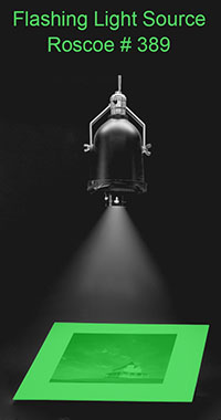
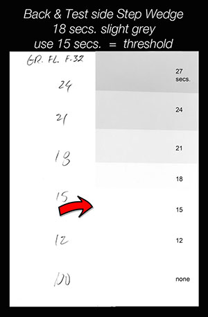 The test for Green Flashing, as seen in the adjacent
illustration, is designed to increase Mid-Tone contrast. The numbers in pencil are on the back side of the MC paper. The Grey tones on the right are the result of the green light of a Roscoe #389 filter falling on the paper
before it is developed, fixed, and dried. The appropriate Flashing time will be slightly less than the first hint of grey-tone after dry-down. Once Flashing times are established no further tests are necessary. The test for Green Flashing, as seen in the adjacent
illustration, is designed to increase Mid-Tone contrast. The numbers in pencil are on the back side of the MC paper. The Grey tones on the right are the result of the green light of a Roscoe #389 filter falling on the paper
before it is developed, fixed, and dried. The appropriate Flashing time will be slightly less than the first hint of grey-tone after dry-down. Once Flashing times are established no further tests are necessary.
Steps for accurate, repeatable Flashing time with colored gels:
- Each brand of MC paper will require testing
- Ilford Warm-Tone and Classic require different times
- Consistent light source
- Consistent f-Stop
- Consistent distance, light source to paper
- Unique testing for both Blue & Green gels required
- Flashing is done after all exposures & with no image visible
There are a few absolutes I follow in my Split-Contrast printing methods; these will prove helpful in understanding my terminology.
- I print with only the extremes of filtration, the Green and Blue gels seen here, or 0 and 5
numeric filtration
- Contrast Formula is the initial combined amounts of Green & Blue exposure to establish a starting work print
- Ratio of Blue to Green is fairly consistent, 25% Green / 75% Blue, but is finely tuned to each print’s end goal
Multi-Contrast papers (MC) have significantly changed the silver printing process. The idea of printing small and unique areas to a specific contrast on a single sheet of Silver Gelatin paper is
pure genius, both from a manufacturing standpoint as well as the power and flexibility afforded the serious silver printer. A brief explanation of the design of MC papers follows.
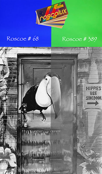 Multi-Contrast papers are designed to respond to
Blue and Green light, respectively producing Hard and Soft contrast tonalities in the final print. MC papers can best be illustrated by the visual example you see here where the left side of the paper
received 10 seconds of pure Blue (grade 5) exposure and the right side received 10 seconds of pure Green (grade 0) exposure. This graphic display of the contrast range in this photo by a
simple change from Blue to Green light begins to illustrate the power and potential of MC papers. These inexpensive Roscoe theater gels seen here in virtually their identical color were used to make
this illustrative photograph on Ilford Multi-Contrast paper. The exact gel numbers I use in printing are shown (Roscoe #68 Blue and #389 Green). Multi-Contrast papers are designed to respond to
Blue and Green light, respectively producing Hard and Soft contrast tonalities in the final print. MC papers can best be illustrated by the visual example you see here where the left side of the paper
received 10 seconds of pure Blue (grade 5) exposure and the right side received 10 seconds of pure Green (grade 0) exposure. This graphic display of the contrast range in this photo by a
simple change from Blue to Green light begins to illustrate the power and potential of MC papers. These inexpensive Roscoe theater gels seen here in virtually their identical color were used to make
this illustrative photograph on Ilford Multi-Contrast paper. The exact gel numbers I use in printing are shown (Roscoe #68 Blue and #389 Green).
Interestingly, there are three separate and different emulsions that make up MC papers, each emulsion made from a different mixture of light sensitive Chloride, Bromide, and Iodide, each responding to
Blue and Green light in varying degrees, incorporated into a single sheet of paper. One emulsion layer is heavily biased towards Green light. A second layer heavily biased towards Blue
light and a final emulsion equally biased towards a normal contrast to ensure a smoother transition in the Mid-Tone areas. In theory when only Blue
light is used the resulting print is very high in overall contrast, conversely when exposed to only Green light the final rendering is very low in overall contrast.
After experimenting and learning how MC papers are designed and respond to Green & Blue light I was able to reason why this technique produces such a significant gain in mid-tone contrast.
The densest area of the negative will produce the lightest grey tone on the print. Therefore, Green exposure targets the minimum amount of time to produce the subtlest grey tones in the
print. So, Green exposure "projected through" the negative will impact to a greater degree mid-tone areas which are not as dense as the highlights. This will effectively diminish mid-tone
vibrancy depending on how much green light passes through the varying mid-tone densities of the negative, easily seen in the pure Green exposure side of the “Hippies Use Side Door” photo
. So, the flashing technique used in this application allows for much less “projected” Green light necessary to affect the lightest grey tones in a print. The reduction in projected Green
light will in varying degrees greatly impact the mid-tone contrast in the silver print. Texture, is enhanced and in many cases actually exaggerated!!
There is always the photographer who says, “what if I don’t want as much mid-tone vibrancy as you Steve”? Very simple, in the contrast formula you choose, simply use more Green exposure and
less Blue exposure in printing. I use this Flashing technique in 90 % of the prints I make!!
Below is the PDF that accompanies my Premium video on all the techniques I use for Split Contrast printing with MC papers. There are visual comparisons and explanations detailing
Flashing for Mid-Tone Contrast. Premium videos are available here: https://gumroad.com/stevesherman
It can easily be said that Green light exposure in any one of the following images could be reduced and more Blue light added to increase Mid-Tone contrast. However, the comparisons seek to
illustrate that Mid-Tone contrast is heightened when Green exposure through the negative can be reduced and all other variables remain constant. There may be times when no Green exposure is
used and only Green flashing to affect highlight tone, as was the case with the print that led to this discovery. A video illustrates the following prints on my YouTube channel:
Less zero-filtration Green Light necessary to affect highlight tonality results in greater Mid Tone Contrast
- Overall Flashing with a GREEN or BLUE gel can reduce zero-filter exposure “projected
through negative” by 40 %.
- Roscoe theater lighting gels # 389 GREEN and # 68 BLUE are very inexpensive and readily
available.
- Bringing MC papers to Threshold allows less initial “0” filtration translating to higher Mid-Tone Contrast.
- The Roscoe # 68 BLUE gel can be especially helpful in creating greater contrast in subtle clouds and bright skies.
Flashing is defined as...“non image forming” light directed at local areas or the entire print bringing paper to its exposure threshold:
- Threshold is defined as... a measured amount of light that BY ITSELF will not cause any tonality whatsoever.
- Use a repeatable light source / make “test step wedge” / target 15 – 25 secs. for GREEN gel.
- Repeat above test... make “test step wedge” / target 15 – 25 secs. for BLUE gel.
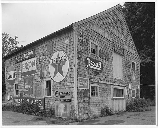
In each print below, notice the sky tonality across the top to quantify identical print exposure.
The print below received no Flashing at all:
|
|
 |
 |
 |
|
|
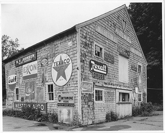
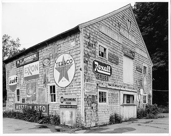
Look for contrast differences in the shingles and also the black of the Rexall sign from one print to the next, there
has been NO print Manipulation done to this point.
Do not confuse GREEN filtration with GREEN flashing !! GREEN filtration light is through the negative.
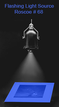
GREEN flashing, without the intervening negative, uses a separate light source with a targeted and measured amount of GREEN light to affect the paper’s threshold.
|
|
|
|
|
Above print exposure f 11.2 10 seconds 0 (green) filtration
~~ 10 seconds of 5 (blue) filtration
The entire Print below received GREEN Flashing @ just below the paper’s threshold:
- Flashing was pre tested @ specific distance & f stop for threshold w/ Green gel i.e. f 32 @ 15 secs.
Above print exposure f11.2 (-50%) 5 seconds 0 (green) filtration ~ (+50%)15 seconds 5 (blue) filtration
- A reduction of 50 % of initial Green filtration exposure is NOT always possible
- Look for contrast differences in shingles and the black of the Rexall sign from one print to the next.
- Mid-tone contrast differences from Green to Blue flashing can be subtle in each print and may
benefit from comparison.
- With my negative design, I use Green gel flashing 90% of the time.
The entire Print below received BLUE Flashing @ just below paper’s threshold:
- Flashing was pre tested @ specific distance & f stop for threshold w/ Blue gel i.e. f 45 @ 18 secs.
Above print exposure f11.2 (-50%) 5 seconds 0 (green) filtration ~ (+50%)15 seconds 5 (blue) filtration
|
Steve Sherman’s photography career began in 1981 when he joined the Connecticut Professional Photographers Association. A
career path in illustration and advertising photography with large film cameras soon gave way to a love of Black and White large film and the environment. Initially inspired by the grand
western landscape made famous by Ansel Adams he soon transitioned to more intimate textural vignettes in the tradition of Edward Weston. By 1985 his work was handled by the prestigious Robert
Klein Gallery in Boston, Massachusetts. Today his work is represented by the Paul Paletti Gallery in Louisville, Kentucky.
The texture of a Southwestern landscape, industrial decay, and what he refers to as “walk bys” provide the greatest joy
with his chosen film formats, 5”x7” for enlargement and 7”x17” for both silver contact prints and the hand coated platinum palladium process.
I believe my Organic Process yields a smoother yet more vibrant transition of tonalities throughout the entire
grey tone palette of the silver print than that of any analog means used in darkroom workflow as of this date.
For those interested in pursuing my Power of Process technique there are several options:
email: steve@steve-sherman.com
Power of Process Separation System - Progressive Negative Design
Reduced Agitation Film Processing
by Steve Sherman
|
|
|
|

 The test for Green Flashing, as seen in the adjacent
illustration, is designed to increase Mid-Tone contrast. The numbers in pencil are on the back side of the MC paper. The Grey tones on the right are the result of the green light of a Roscoe #389 filter falling on the paper
before it is developed, fixed, and dried. The appropriate Flashing time will be slightly less than the first hint of grey-tone after dry-down. Once Flashing times are established no further tests are necessary.
 Multi-Contrast papers are designed to respond to
Blue and Green light, respectively producing Hard and Soft contrast tonalities in the final print. MC papers can best be illustrated by the visual example you see here where the left side of the paper
received 10 seconds of pure Blue (grade 5) exposure and the right side received 10 seconds of pure Green (grade 0) exposure. This graphic display of the contrast range in this photo by a
simple change from Blue to Green light begins to illustrate the power and potential of MC papers. These inexpensive Roscoe theater gels seen here in virtually their identical color were used to make
this illustrative photograph on Ilford Multi-Contrast paper. The exact gel numbers I use in printing are shown (Roscoe #68 Blue and #389 Green).