 |
|||||
|
|
|||||
Power of Process Separation System... by Steve Sherman
The second component of my Power of Process is Exposure & Negative Design where MC paper can show its potential before we even get in the darkroom! Edward Weston once said, “I don't care if you make a print on a bath mat, just as long as it is a good print.” In a basic sense that is my philosophy. My area of experience and technical mastery lies in Large Format film and the wet process Silver Gelatin print. The process has become second nature and as a result I’ve made intuitive decisions and discoveries leading to this article. I don’t plot graphs or do an inordinate amount of testing. My photographs are my tests; if I don’t like something I make only one change at a time and re-evaluate the final print. In that sense I subscribe to the “eye test”. While I didn’t realize it at the time, my longtime friend and mentor Jack Holowitz turned me on early in my career to what I consider to be the finest Silver Gelatin enlarging paper manufactured since the 1950’s, Agfa’s Portriga Rapid, a warm-tone chloro-bromide emulsion fiber-base paper. I still have a decent stock of the quality Portriga manufactured pre 1988 but only use it for one particular body of work. The main reason is that modern MC papers have made significant gains since they became popular a generation ago. The sheer flexibility and potential to affect unique areas of contrast in virtually any area on the print simply out weighed the look and color of a Portriga Rapid print. It was the separation in the deep shadows and mid tones where Portriga excelled; I have been chasing that separation since Portriga’s emulsion was changed in 1988 due to environmental concerns. Let’s first examine the traditional Zone System as we move along. Traditional Zone System Analyzed
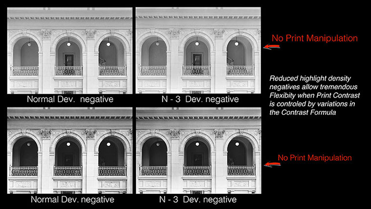
The Adams Zone System relied on negative contrast relationships to produce a full range B&W print, almost always printed on what were known as Single Grade Silver Gelatin papers. These “grades” of paper ranged from 0, very soft contrast, all the way to grades 4 and even 5, which produced extreme contrast, almost devoid of mid tone greys. These grades of paper allowed the creative photographer a broad range of aesthetic expression in the final print. To take full advantage of Single Grade papers the negative densities had to be very specific to produce the desired tonal relationships in the final print rendering. Adams was a Master at conveying his emotions in a Black & White photograph. His goal in designing the Zone System was to exercise creative control over the tones rather than be bound to a Literal rendering and for that we each have been gifted a clear path to Creativity! For years I used the Zone System of exposure and negative development in my technique and workflow. While certainly subjective, my style evolved long ago, responding to rich texture in the shadow region, a heightened sense of mid tone contrast, and good detail in the highlights. In that context, it is easy to reduce Adam’s Zone System down to the least common denominator. Zones 3 thru Zone 8 are the beginning and ending parameters of tonalities, which reproduce most easily and with detail on “normal grade” Silver Gelatin enlarging papers. I realized a design change was necessary to capture the Mid Tone Separation of higher contrast papers over normal graded papers. I eventually learned to be consistent with low value exposure while reducing highlight density through compressed development so I could intentionally use a higher contrast paper during the printing process. Simply put, I preferred the Mid Tone relationships and vibrancy of the higher contrast papers when compared with normal contrast papers. In the purest sense of the Zone System that is an ambiguous statement, reducing negative contrast with the intention of using a higher contrast paper goes against sensitometric theory. As with so many things theory only makes up part of the equation, the WHY! Arguably the most important part of the equation is the Execution, that is the HOW...you’ll learn about my HOW in the section on Exposure & Negative Design below. With the advent of high quality MC Silver Gelatin papers the potential exists to design negatives in a much different and more economical way than traditional wisdom and practice would suggest. I refer to the Negative Design and Silver printing technique that I employ as the Separation System. A broad description of my Negative Design and final Silver Gelatin print is largely a function of the contrast potential inherent in MC papers. My exposure, negative design and processing will allow the same negative to produce the Brett Weston look, or the more open and detailed shadows of his father and mentor Edward Weston. This flexibility begins with generous shadow exposure and reduced or compressed development of the highlight region of the original scene contrast. While I don’t foresee myself moving away from exact development for specific scenes of contrast with Large Format film, consider the photographs in Fig. 2 and how the Separation System with MC papers will allow any film photographer the advantage of what used to be available only to single sheet film users. It’s important to note the prints below are identically matched from dramatically and differently designed negatives. In the similar sense of unique negative development, MC papers can produce equal prints from a variety of negative designs with varying degrees of contrast.
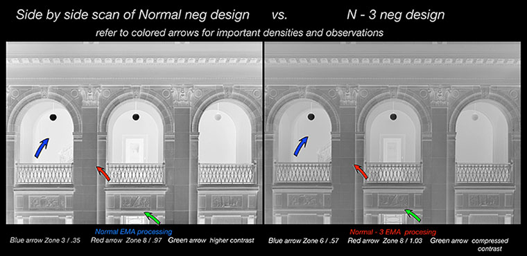
The above print comparisons come from the two negatives shown in a single scan below in Fig. 3. The negative on the left side is a Normal contrast range negative showing Zone 3 shadow density with a Zone 7 value on the face of the granite arches. The negative shown on the right has a shadow value placement of Zone 6 pushing the granite arch value to Zone 10 requiring an N–3 development to compress the higher exposed highlights. What I call my Contrast Formula, this combination of 0 & 5 filtration enables virtually identical prints from either negative. The top row of prints receive more 0 and less 5 filtration while the bottom prints receive less 0 and more 5 filtration to effect different final prints. To be clear, I print with only 0 and 5 filters;, however, that is NOT split contrast printing, rather it is nothing more than reproducing graded filter paks by combining the extremes of what the emulsion reacts too, Green light for soft contrast and Blue light for hard contrast.
Multi-Contrast Papers and Split Contrast Printing Careful research reveals Variable Contrast silver gelatin papers were actually introduced in the 1940's. 2 I’ll start by prefacing that my belief is people respond first to Mid Tone Relationships of contrast in a Black and White photograph, while the very dark and light values provide a point of reference for those Mid Tone Relationships to captivate and maintain the viewers interest. Let’s examine how Multi-Contrast papers are formulated. Multi-Contrast papers are designed to respond to Green and Blue light, respectively producing Soft and Hard contrast in the final print. Surprisingly there are three separate and different emulsions that make up MC papers, each emulsion made from a different mixture of light sensitive Chloride, Bromide, and Iodide, each responding to Blue and Green light in its own unique way. One emulsion layer is heavily biased towards Green light, a second layer heavily biased towards Blue light, and a final emulsion equally biased towards a normal contrast rendering. 3 So, in theory, when only Green light is used the resulting print is very low in overall contrast; conversely when exposed to only Blue light the final rendering is very high in overall contrast. An equally biased third emulsion layer I believe is designed to allow a smoother transition of tonalities in the Mid Tone region. More on this third layer below. ** We’ll learn later that my suggested highlight densities are extremely compressed and the main reason is the Green sensitive emulsion in MC papers has a much broader response to negative densities than the Blue sensitive layer; what that means is the Green exposure will affect not only the highlights but all densities of the negative’s diminishing mid tone contrast. The Blue sensitive emulsion has a more narrow response to low value density and will impart much more contrast in the low & mid tone values and will never reach the highlight region until the low and mid tones are overly contrasty and dark. Negatives with reduced highlight density require a smaller amount of Green light to affect highlight detail, which allows more Blue light to be used in the Contrast Formula which ultimately makes it’s way up into the Mid Tone region, creating greater Separation of those tonalities! I think of the Green or soft contrast exposure in the printing process as Contrast Killing Green Light.
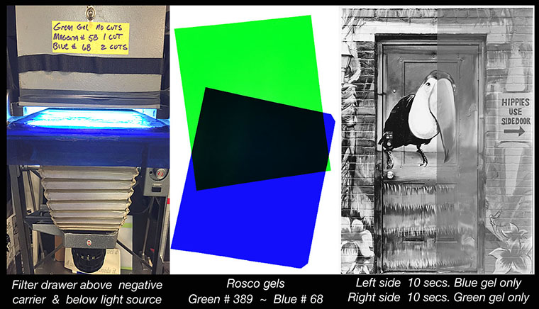
Manufacturers of MC papers produce proprietary “filter paks” designed to be used with the manufacturer’s papers after purchasing an expensive set of colored filters to effect varying degrees of contrast, usually in ½ grade increments. These filter paks were intended to be used below the lens and are not optical grade and can in fact degrade final image clarity. The manufacturers have designed their filter paks to be “subtractive” in nature, in other words they remove a certain part of the light spectrum to bias the light towards either Green or Blue. That design concept also allows the manufacturer to set “speed points” so that grades 0 thru 3 provide differing levels of print contrast while maintaining a consistent exposure, grades 4 through 5 usually require one additional stop of exposure but again provide consistent printing times between grades 4 & 5. In reality all that is necessary to effect the extremes of contrast is a single Green filter and a single Blue filter. I use ordinary theatre lighting gels made by Roscoe: # 389 Green and # 68 Blue to effect the maximum contrast even when compared to my proprietary Ilford 500 head. The down side of the Roscoe gels is they severely degrade the projected image and must be used above the negative stage but below the light source, my Beseler 45M enlarger had to be modified as seen in Fig. 4 below.
The up side of using a single Green and Blue gel is lower cost and infinite contrast possibilities. The downside is the need to modify any enlarger that does not have a “filter drawer” above the negative stage. There is a bit more trial and error in determining what I call a Contrast Formula, i.e. determining the exact amount of Green exposure in concert with Blue exposure to affect the overall contrast of difficult areas of the print. With consistent Exposure & Negative design a formula will become more predictable. To be clear, there are a number of ways to better affect the contrast layers within MC papers than using the Filter Paks sold by paper manufacturers. I use a Color Head such as the Ilford 500 almost exclusively now. Those light sources and my Split Printing technique should be left for an article dealing exclusively with that topic. I want to eliminate any confusion about the Split Contrast printing technique, I use only 0 & 5 filtration, or Green and Blue in combination, which is not Split Contrast printing. It is merely arriving at a specific contrast formula, much the same as using a grade 2.5 filter. Only when separate and specific areas of the print are burned or dodged within either the green or blue exposure has Split Contrast printing actually occurred.
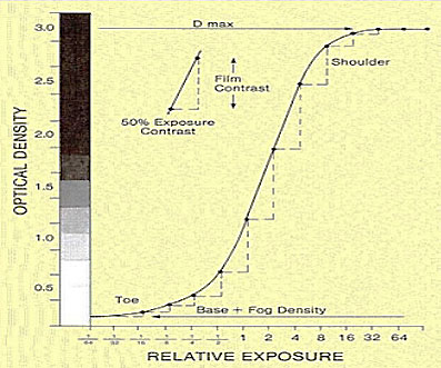
Negative Design and the Separation System Light & Composition, Exposure & Negative Design, Pyro Processing & Extreme Minimal Agitation, Split Contrast Printing & Multi-Contrast Papers and Split Toning & Archival Permanence are the 5 components of my Power of Process methodology, which produces specifically designed negatives for multi-contrast Silver Gelatin prints, each targeted at creating greater separation in a 2 dimensional photograph. It is the very power of MC paper and the split printing technique that make progressive negative design possible. As single grade papers became more and more difficult to find, I naturally switched over to an unknown in the form of MC papers. What I first noticed with traditional Zone System processed negatives, where full contrast was intentionally built in, was that matching the print’s deepest shadows and its brightest highlights was much the same with older single grade papers and the new MC papers. What stood out most were the mid tones: the new MC papers fell short of the smooth transition exhibited by graded papers from a generation ago. The MC transition of tonalities was unacceptably harsh. That began the thought process that there was too much contrast in older designed negatives: the separation of tonalities in those negatives was too great for modern MC papers to reproduce in a pleasing way. I began to think by exposing much more shadow information into the negative I would always be able to “print it down” with harder contrast exposure if I felt a need, because of the flexibility of MC papers. Naturally, with increased shadow exposure comes increased highlight exposure and unwanted density. Compressing development easily cures that problem; in fact a huge factor in my Separation System is compressed highlight density. To quantify in numbers, a traditional AA Zone System highlight density is suggested to be 1.25 – 1.30 above film base plus fog. (See illustrative Zone scales below.) That highlight density is aimed at producing a full range of contrast from Zones 3 through 8, to render easily on a Normal grade 2 Silver Gelatin paper commonly used a generation ago. ** My theory regarding the inclusion and function of the third evenly biased emulsion layer in Multi-Contrast papers, while I have never heard a reason or witnessed a discussion about its purpose I believe there is an imbalance that manufacturers are trying to overcome using that third emulsion layer. I believe this layer is to help with a smoother transition of tonalities in the mid tone region because the Blue and Green biased layers by themselves fall short of producing adequate and pleasing mid tone transition and relationships. I offer this reasoning because I have many negatives which were designed years ago using the traditional Adams Zone System with zone 3 shadow information and reduced highlight density yet when using my split printing technique and today’s MC papers that I presently use I am able to get rich shadows and detailed highlights however, the Mid Tones are noticeably too harsh. I believe that third layer’s main function is to provide a smoother transition within the mid tone region. Therein lies the reason I design my negatives with abundance of shadow and mid tone values while not allowing the highlights to climb as high on the straight line of exposure by significantly compressing highlight density. With that negative design I am able to use a smaller amount of Green filtration and an unusually high amount of Blue filtration. My negative design provides for shadow values up on the straight line where they naturally separate better but because they have been so compressed during development the imbalance of MC paper’s mid tone performance is negated yielding prints of smooth yet vibrant mid tone relationships. Processing film in a Pyro based chemistry does play into greater tonal separation, however, the philosophy of affecting print contrast with MC papers rather than negative density is unchanged. In the interest of full disclosure, there are accomplished and noteworthy large format film photographers who have written that severe highlight compression such as I am suggesting will degrade mid tone contrast to an unacceptable level. That has not been my experience, in fact heightened mid tone contrast has become the hallmark of my silver gelatin prints using that very negative design.
I have over the last few years continued to push traditional thinking beyond what was considered possible and adapted those findings to my separation process. My negative design builds additional tonality in lower zones, 3, 4 & 5, typically moving highlight exposure densities to zones 10, 11 & 12. Compressing highlight density using Pyro processing to a highlight density of no more than 1.00 provides significantly smoother transition of tonalities, particularly in the mid tone region when expanded with MC papers using my printing technique. The biggest push back I get is, "what if I don't want as much shadow detail or mid tone contrast as you do"? Simply use more 0 or green filtration in the contrast formula and mid tone contrast will diminish, add more 5 or blue filtration and the shadow values merge together for less detail and a more abstract rendering. Lastly, if you find your prints on MC papers are too harsh, you must realize there simply is not sufficient tonality built into your older negatives for the MC papers of today to produce the prints that typically rendered perfectly on the graded papers of days gone by. A second and equally important component to my Separation System is the compressed highlight density, compressed being a reference to my targeted highlight density of .95 - 1.00 above film base plus fog as opposed to traditional zone system wisdom of 1.25 – 1.30 above film base plus fog. When that negative design is used in conjunction with additional shadow value exposure it produces a negative that is rich in tonality. I often describe my philosophy as building tonality with exposure and adjusting contrast during the printing process. Many well known large format photographers who have seen my prints have had very kind things to say, in fact one suggested “the prints don’t look photographic" --Michael A. Smith, PA A ONE on ONE student after seeing my negatives described them as "disturbingly flat" --Dr. Alan Wagner, VA Another student offered "if I didn't see you make that print from that negative I never would have believed it" --Claudio Szarfsztejn, South America In summation, clearly all things visual are subjective in nature and will be judged by one’s personal aesthetic. My unconventional Exposure & Negative Design is made possible by the advancement of multi-contrast papers and the flexibility that can result from understanding how to best exploit what the new papers have to offer. The general philosophy of building tonality through exposure and creating and controlling contrast during the printing stage are the underlying principles of my exposure and negative design. The silver gelatin process is already the highest contrast medium in B&W photography short of any type of lithography process. As I stated earlier, it is the Mid Tone Relationships that most people respond to when viewing a silver print and are the most difficult to exaggerate without compromising the deep shadow values and delicate highlight values. My reaction to HDR photography is that it produces overly saturated and exaggerated relationships in color; however, if someone were to suggest my exposure and negative design is essentially the same, I’m not sure I could argue the point. I choose not to use any type of contrast masking or computer aided technique in my final prints. I believe my Organic Process yields a smoother yet more vibrant transition of tonalities throughout the entire grey tone palate of the silver print than that of any analog means used in the darkroom workflow as of this date.
Steve Sherman’s photography career began in 1981 by joining the Connecticut Professional Photographers Association. A career path in illustration and advertising photography with large film cameras soon gave way to a love of Black and White large film and the environment. Initially inspired by the grand western landscape made famous by Ansel Adams he soon transitioned to the more intimate textural vignettes in the tradition of Edward Weston. By 1985 his work was handled by the prestigious Robert Klein Gallery in Boston, Massachusetts. Today his work is represented by the Paul Paletti Gallery in Louisville, Kentucky. The texture of a Southwestern landscape, industrial decay, and what he refers to as “walk bys”
provide the greatest joy with his chosen film formats, 5”x7” for enlargement and 7”x17” for both silver contact prints and the hand coated platinum palladium process. I believe my Organic Process yields a smoother yet more vibrant transition of tonalities throughout the entire grey tone palette of the silver print than that of any analog means used in the darkroom workflow as of this date. This is the first in a series of three articles on my Process of designing negatives, Pyro processing with a minimal agitation technique, followed by an article on my methods of Split Contrast printing to tie all three together.
For those interested in pursuing my Power of Process there are several options:
email: steve@steve-sherman.com |
|||||||||||||||||||||||||||||||||||||||||||||||||||||||||||||||||||||||||||||||||||||||||||||||||||||||||||||||||||||||||
|
|
|
|
