 |
|||
|
|
|
Vandyke Notes by Wynn White Introduction
The Vandyke Brown Print The Vandyke brown print is based on the first iron-silver process, the argentotype, invented in 1842 by the English astronomer, Sir John Herschel. Both processes utilize the action of light on ferric salts and their chemistry is very similar. The Vandyke process gets its name from its similarity in color to the deep brown pigment used by the Flemish painter Van Dyck. Vandyke brown prints are very simple and economical to make, with the sensitizer consisting of three readily available chemicals. Clearing is carried out in water and fixing is done in a weak solution of hypo. Vandyke Formula The following formula was taken from Bob Schramm's article in Post-Factory Photography. I have tried varying the amounts of each of the three ingredients but have found the basic formula to give the best results. Adding more tartaric acid seemed to increase contrast slightly and move the image color to a more neutral gray but then graininess became a problem. Adding more silver nitrate didn't have much effect, as was the case with more ferric ammonium citrate. I doubled the amount of all the chemicals in the formula in an attempt to make a single coat solution and got excellent contrast with rich blacks but grain was again a problem. A drop or two of 1% gold chloride can be added to the sensitizer just before coating to move the image color towards purplish-brown. My main supplier of chemicals is Artcraft Chemicals (http://www.artcraftchemicals.com/) and I highly recommend them. Solution A Combine Solutions A and B and slowly add C while stirring. Pour the sensitizer in a brown bottle and let it age for a few days before using. Keep it stored in a dark place. I keep mine in a covered box. I have used sensitizer that had been sitting around for a year or so and it was fine. Care should be taken when mixing. Paper
Canson Lavis Technique, Lana Royal White, Cotman Take (Japanese for bamboo) Bristol, Rising Stonehenge White, Rising Stonehenge Warm White, Rising Gallery 100, and Holbein albireo are papers that I have had good results with. Most of my paper is purchased through Daniel Smith (http://www.danielsmithpaint.com/) in Seattle or Sekaido in Tokyo. Coating I use a coating rod made out of glass tubing but foam brushes, first dampened, work very well too. I have tried using the traditional Japanese hake (literally brush in Japanese) but prefer the coating rod. Bostick & Sullivan (http://www.bostick-sullivan.com/techart.php) sells a very nice one called a puddle pusher or you can make one without much difficulty. Breaking the glass tubing is the tricky part but with practice it can be done. Place the paper on a flat surface. I use a sheet of 6 mm plexiglass. Using masking tape that has been applied to fabric a few times to make it less sticky, tape down the four corners of the paper. A lot of people recommend marking the area to be sensitized with a pencil but I prefer not to do this. Rather I place a piece of paper or film to the side so that I know how far down to bring the rod. To transfer the sensitizer from the brown bottle to the paper I use .5 ml or 2 ml bulbed pipettes, depending on the size of the image. The pipettes have been pre-marked so that I know the correct amount of sensitizer to load into them. I take up the correct amount of sensitizer into the pipette and lay a bead along the glass rod that is being held at the top of the paper. Rock the rod back and forth a couple of times to make sure that the sensitizer is evenly distributed across the rod and then make a pass to the bottom of the paper. When you reach the bottom of the paper lift the rod and place it on the back side of the bead and move it toward the top and repeat until five passes have been made. Bring the fifth and final pass down slightly lower than the previous passes and then absorb any excess sensitizer with a paper towel. The New Platinum Print by Richard Sullivan and Carl Weese has an excellent section on hand coating. There is an online sample page from this book that gives a step by step discription, including photographs, of glass rod coating. It can be seen at http://www.bostick-sullivan.com/techart.php.
The Vandyke print is not nearly as sensitive to light as gelatine-silver enlarging paper but I have noticed slight fogging unless I work under red light. I have a small red 7 watt light bulb that hangs about one meter above my coating area. Since I started using this red light I haven't had any problems with fogging. Sensitized paper is best used right away but I have, on several occasions, coated the night before, and then sealed the paper in a light tight plastic envelope and printed the next day with good results. To facilitate coating on overly absorbent paper I have tried applying a gelatin or starch sizing but haven't had good luck with this technique. I have however done well by adding a few drops of gum arabic 10% solution to the sensitizer just before coating. For papers that don't absorb the sensitizer well I add drops of 2% Tween 20. Contrasting Agent Potassium dichromate can be used as a contrasting agent. I have several small bottles containing pre-mixed solutions of from 1% to 5%. I add one drop of the various percentage solutions depending on the amount of contrast I wish to add. Exposure must be dramatically increased when potassium dichromate is added to the sensitizer. With one drop of 3% dichromate added to 12 drops of sensitizer exposure must be nearly doubled. Negatives Negatives used for Vandykes should be somewhat more contrasty than those used for gelatin silver. Since paper for Vandyke prints is so slow it is only possible to make contact prints and consequently large format negatives are generally used. I have made nice prints from negatives as small as 6x7 however. Groups of small negatives can also be used. If only small negatives are available enlarged negatives can be made. I have had the best results using the Liam Lawless reversal technique that is described in detail in Post-Factory #2. The process uses inexpensive lith film and is relatively easy to carry out. Light Source
Printing Frame To maintain good contact between the negative and paper a contact printing frame is necessary. This apparatus resembles a picture frame but has a hinged and spring loaded back. The the one that I use was purchased through Bostick and Sullivan and I highly recommend it. Exposure I first write notes to myself on the back of the paper such as exposure time, date and print type. The printing frame is opened and the paper set emulsion side up on the inside of the hinged back. The negative is placed emulsion side down on top of the paper and then the glass and frame is placed over them and locked in place. The frame is placed in the UV printer and the exposure is made. My printer is connected to a Gralab timer and exposure times range from four to twelve minutes. Dodging and burning is generally not necessary but if it is carried out protective glasses should be worn as UV light is damaging to the eyes. As I prefer not to show brush marks, I cut out a mask made of red construction paper that is just slightly larger than the negative. I place the mask on the paper and center the negative in the cut away area of the mask. Besides giving a neat appearance to the image a mask makes it possible to see whether or not the print has completely cleared or if there is any fogging. If a diffused edge is preferred on the image, the mask can be placed on top of the glass rather than under it. Processing Vandyke is a print out process and after exposure a faint image is visible, with the print showing approximately half of its final density. The image will darken greatly after going into the fixer and then darken even more after the print has dried. It is better to print the image a bit on the dark side since it can be reduced later. Most sources state that Vandyke prints can be cleared in plain water. In Mike Ware's description of the the argyrotype process (http://www.mikeware.co.uk/mikeware/Argyrotype_Process.html) he explains the problems iron-based silver processes have. If processed in an alkaline solution residual ferric iron is left in the print which will eventually cause it to fade since iron (III) will oxidize silver. After reading this I decided to change my personal clearing procedure. Since my tap water is quite alkaline at a pH of about 8 I feel that there is a danger of insoluble iron being left in the print after a conventional wash. To avoid this problem rather than use running tap water to clear Vandykes I run them through a series trays that have been filled with water to which I have added a pinch of citric acid so that the pH falls just below 7.
After I have cleared the print I place it in a 5% solution of plain hypo and agitate it for two minutes. This is the point where reduction of the image starts to become apparent. I next move the print to a full strength hypo clearing agent for three minutes. 20 grams of sodium sulfite added to 1000 ml of water works as an effective clearing agent. After clearing and fixing Vandyke prints I give them an initial wash of 30 minutes in an archival print washer and hang them by the corners above my sink with plastic clothes pins to dry. Vandyke Reducer Potassium Ferricyanide .25 gm (one micro spoon used for stirring coffee) Prints are immersed in water and then checked to make sure that there are no bubbles on the surface. They are then transferred to the reducer and agitated until the desired density is achieved. Reduction seems to be most pronounced in the lighter areas so great care must be taken to avoid wiping out delicate highlight details. This reducer has a tendency to increase overall contrast. After reduction prints are treated in a hypo clearing agent for three minutes and then washed for thirty minutes. My standard practice is to print a bit dark and then reduce back. Again I stress the importance of not allowing the print to remain in the reducing bath too long. It is better to take it out just before the desired reduction is achieved. Inspect the print after it is dry and if further reduction is necessary one can go back to a fresh reducing bath, possibly at a greater dilution for more control.
Selenium toner moves the image color from a reddish-brown towards a chocolate brown, which I prefer. If toned to completion the image reaches a yellow-brown that I don't find particularly appealing. Before toning I place the print in plain water and make sure that I have removed all of the air bubbles from its surface. I put the print into the toner and agitate it until the desired degree of reduction or tone has been achieved. I treat the print for three minutes in hypo clearing bath. After toning I wash Vandyke prints for one hour. Gold Toner I use Clerc's thiourea gold toner and it works very well with Vandyke prints with no staining. Gold toner moves the image color toward purple and finally to a neutral gray when toned to completion and does not reduce the image. With some images a split tone of purple-brown and gray can also be achieved. Gold toner will still have an effect on the image color of prints that have been previously toned slightly in selenium. For prints that I want to keep from going too far towards purple or gray I halve the amount of gold in the formula. After toning I wash the prints for one hour. The following formula and information was taken directly from Making Kallitypes by Dick Stevens. Clerc's Thiourea Gold Toner The solution requires no aging; it is ready for use directly after mixing. It tones highlights and shadows at the same rate so the print tones evenly and can be removed from the toning bath at any time. It keeps well and resists decomposition even after moderate use. Formula Compounding Make up a 1% stock solution of gold chloride by dissolving one gram of gold chloride (AuCl3HClH2O) in 100 ml of distilled water. Keep the solution in a brown bottle. Likewise, make up a 1% stock solution of thiourea. Uncontaminated, these solutions keep indefinitely. Add the thiourea solution to the 12.5 ml of gold chloride solution until the precipitate that forms is dissolved. The quantity of the thiourea solution should be slightly more than that of the gold chloride. Add the tartaric acid to 150 ml of distilled water. Add the gold thiourea solution to the acid solution and mix thoroughly. Last, add the salt, top off with water to 250 ml and stir until the solution is uniform. Bottle and label the solution.
Make sure that the tray and tongs that you use are clean. Immerse the the developed, cleared, and rinsed print quickly into the toning bath (or pour the toner onto the print). Agitate the print frequently during the toning period--five to ten minutes, depending on the condition of the toner. After toning proceeds to a satisfactory color, rinse and fix the print. Finally, wash the print for 20 minutes.
When I first started making Vandyke prints I didn't intend to stay with the process for long, thinking that I would move on to platinum or palladium after I learned how to hand coat. The more that I worked with this simple process the more I grew to enjoy it and the more I realized its potential as a method for making stunning prints at a very affordable price. I am certain there are many more discoveries to be made with the Vandyke process and I intend to continue working with it in the future. |
|
|||||||||||
|
Article and images copyright 1985-2001 by Wynn White. |
|||||||||||
|
|||||||||||
 |
|||||||||||
|
|
|
|
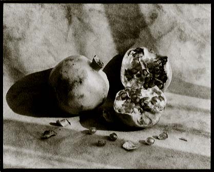 I was first drawn to the Vandyke process when I became dissatisfied with the lack of variety and character of the baryta base of
conventional gelatin-silver photographic papers. I wanted to make prints on some of the many beautiful and interesting papers that are available to printmakers and watercolorists and first worked with salted
paper but with limited success and considerable frustration. That was when, in January of 2000, I read Bob Schramm's article on the Vandyke process in Issue #1 of The World Journal of Post-Factory
Photography. I tried my hand at Vandyke and was able to make satisfying prints on my first attempt. I was immediately hooked on the process and from the beginning started keeping
notes on what did and didn't work for me. I wish to share with you what I have learned.
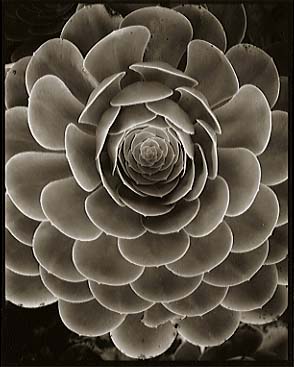 A wide variety of papers can be used to make Vandyke prints and part of the fun is searching for a paper that suits one's taste aesthetically. Image color and contrast will vary
from paper to paper and with some papers the chemistry of the sensitizer doesn't match the chemistry of the paper, resulting in blotchy or grainy images. Paper is usually
purchased in large sheets and then cut to size and, if a deckled edge look is desired, paper can be torn to size rather than cut. I use a metal straight edge to tear paper and
haven't had any trouble with detached metal particles although I have read that this can be a problem. After cutting, the name of the paper should be written on the back of each piece so that it can be identified later.
 After a sheet of paper has been coated I place it in a photo
paper box to avoid exposure to light while I coat the next sheet. I place that next sheet in another box and continue coating until I have done about six or eight sheets. I dry each
sheet with a hair dryer and give them a second coat. I have tried single coating Vandyke prints but have found the dark areas of the print to be very weak. Double coating is a must.
 Exposure is made under a strong UV light, with the sun being the traditional source. The weather here in Japan is so
variable that I decided that rather than use sun light I would make a UV printer. I bought five 60 cm florescent light fixtures, attached them side by side to a 38x60 cm wooden
base and wired them in series with a cord running out of the last one. I took out the fluorescent tubes and replaced them with uncoated black lights. They have the code BL written at
one end. The BL tubes are much cheaper than the deep blue BBL tubes and work just fine. I attached 20x38 cm boards lengthwise to each end of the printer to support the lights that
point downward. The distance between the lights and the printing frame is approximately 8 cm. I put canvas flaps over the front and back to keep the UV light from escaping.
  Before processing begins I put on a pair of rubber gloves to keep my hands from coming in contact
contaminated clearing baths. I place the print in the first tray and agitate it for one minute and then move it to the next tray and do the same until the print has moved through eight changes of water. Eight trays is
probably overkill but I want to make sure that I get all of the iron out of the print. After I have finished the clearing procedure I dump the contents of the first tray and pour the contents of the second tray
into it and so on until I get to the last tray to which I add fresh acidified water. To avoid fogging I have illuminated my clearing area with a small red 7 watt light bulb that hangs about one meter above my darkroom sink.
 Kodak rapid selenium toner works well with Vandyke prints but contains ammonium thiocyanate
which reduces the silver image so it must be used at a very weak dilution. I mix 2 ml of selenium toner with tap water to make up 500 ml of working solution. Even at this dilution great care must be
taken not to overreduce. Reduction seems to take place mainly in the darkest part of the image so selenium toner can be used to reduce prints that lack contrast in the shadow areas.