|
Lith Printing... An Introduction
By Tim Rudman
 |
|
|
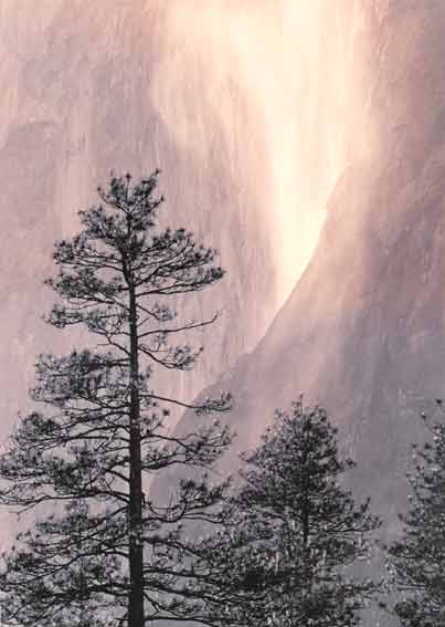
Printed on Sterling Lith paper, developed in dilute Kodalith developer. This untoned print illustrates the Lith
print characteristic of printing 'soft in the highlights, hard in the shadows'. Even with the grainy 35 mm Kodak High Speed Infrared film the light values are creamy and grainless
with an almost ethereal beauty. The shadow tones print high-contrast, separating deep dark detail with ease. It also shows the natural affinity that Lith printing has with infra-red
photography.
|
|
|
Lith printing is not a new process, but it did fall out of favour when Kodak withdrew their beautiful Lith paper ‘Kodalith LP’ about
twenty years ago. Now, Lith printing’s star is in the ascendancy once again and this time rising higher than ever before. An increasing number of paper and photo chemistry manufacturers are
responding to this renewed interest by producing materials that ‘work’ with this process and the choice available to anyone wishing to make Lith prints is now considerable.
What is Lith Printing?
Before considering what Lith printing is, it may be helpful first of all to state what it isn’t, as this often gives rise to confusion.
Contrary to many people’s assumptions ‘Lith printing’ has nothing at all to do with Lith or line film, ultra high contrast separations, or other similar graphic effects where all intermediate tones are
eliminated in order to render the image in only pure black and pure white.
Lith printing is a simple but ‘different’ Black & White printing technique, using ‘ordinary’ B&W
or colour negatives, a suitable black & white paper and Lith developer – from which the process gets its name. It involves heavily overexposing a suitable black and white paper – usually by two
or three stops - and then only partially developing it in a highly diluted lith developer.
This process has often been shrouded in mystery and described as ‘unduplicatable’ with no two
prints ever looking similar. I don’t agree with this and have attempted to unravel the mechanics of the process in order that, by better understanding what is happening, one may control and therefore
predict results. As is often the case with such things, it turns out that the rules of the game are actually quite simple. Certainly it is a very controllable process and it is possible to reproduce
results very closely.
What do Lith prints look like?
This is a very creative printing process and the results are unlike conventional black and white
printing in several respects. The prints produced using this technique can often be more ‘arty’ looking than conventional black & white prints.
Lith prints are colourful even before toning and may contain warm coloured mid and light tones of unusual delicacy and beauty, sitting alongside shadow tones with the opposite properties of high
contrast and cold colour. Having said that, the process is extremely flexible and prints may be made with quite different properties. They may be extremely warm or very cold toned. They may
be soft and subtle or gritty and graphic. The actual colours vary with the materials and techniques used. This is an extremely expressive medium and will take your photographic creativity onto a new plane.
Lith prints also tone very enthusiastically, particularly in selenium and in gold. The latter produces wonderful clean blues of a hue never seen with conventional prints in this toner.
The range of contrast available through Lith printing is huge – much greater than with graded or variable contrast papers. More importantly, the process can produce different contrast and texture
in different parts of the tonal range of a print – soft in the highlights and hard in the shadows. This juxta-position of soft warm creamy grainless light tones and hard cold gritty low values is not only
aesthetically beautiful, it can also be the answer to a printer’s prayer for some difficult negatives, as the highlight and shadow details can be controlled separately and independently.
What materials are required?
Negatives: In terms of negatives, normal full range negatives are ideal. Infrared negatives lend
themselves particularly well to this process. Colour negatives will often lith print very well and much better than they do with other black and white printing methods. Try anything.
 |
 |
|
|
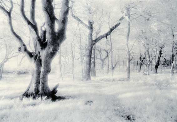
Lith Print on Fotospeed Lith paper developed in LD20 Lith developer, Gold toned 15 minutes. Kodak infrared
film. Gold toning produces wonderful delicate blues with 'early snatch' lith prints, and dark sombre ones in 'late snatch' Lith prints that have been developed to
a larger grain size. It is also an archival toner.
|
|
|
Papers: These vary in their ‘lithability’. Some are not suitable to Lith printing and those (notably
resin coated) papers that contain incorporated developer generally do not work well, but there are one or two exceptions to this. There is only one dedicated ‘Lith Paper’ at the time of writing but
quite a lot of ‘general’ papers work extremely well with this process. Those that are suitable do
not all give the same colours or other ‘lithy’ effects and they do not all respond to toners, particularly selenium, in the same fashion. This makes lith printing great fun and also means that
everybody’s lith prints do not look the same.
‘The’ Lith paper was until recently made by Sterling in India. Production has now ceased and the
factory has been demolished. Fotospeed now produce the only dedicated Lith paper. Fotospeed Lith is said to be based on the Sterling Lith paper formula, but it is made in Europe and has
completely different properties to the original Sterling Lith paper. Similarly the Kentmere papers Kentona & Art Classic and the Luminos Tapestry paper, all described in my Lith printing book,
have all had significant formula changes and all Lith print well but quite differently to their previous versions. Other excellent papers for this process are Maco Expo papers, most Forte
papers, Oriental Seagull, Fomatone and more recently Paterson’s new RC Acugrade Warmtone. A fuller list of suitable papers can be found in my Lith book, but remember that papers change all the
time, so be prepared to experiment. Many papers that will not Lith print will do so if they are bleached after normal processing and then redeveloped in Lith developer. Again there is a chapter
devoted to this in my Lith Printing book. The results are often quite different again.
Developer: At the heart of lith printing is the process of ‘infectious development’. (Don’t worry –
you can’t catch anything, although the process is ‘contagious’!) Infectious development is a
property of high energy Lith developers and these are essential to this process. Mostly these are 2 part developers, which are mixed together and diluted for use. An unusual single solution
alternative is Lithoprint from Speedibrews.
Normal stop bath and fixer can be used. Variations and refinements can be made for more advanced applications but standard brews will serve for most purposes.
Safelights: Extra care should be taken with safelights. Exposure times for Lith printing are longer
than usual and development times are significantly increased and may be very long. The safelight colour is determined by the paper in use rather than the process, but if in doubt red is a safer
choice. Although not essential, a safelight torch is enormously helpful when assessing the exact point at which the print is ‘snatched’ from the developer.
How does it work?
 |
|
|
Untoned Lith Print on Fotospeed Lith paper developed in LD20 Lith developer. Lightly pre-flashed before
exposure. Lith printing allows independent separate but fine control of highlight and shadow tones.
|
|
|
The whole process of Lith printing relies on a property of Lith developers known as ‘infectious development’. This is different
to the way normal developers develop a black and white image. In simple terms, infectious development means that the darker a tone becomes, the faster it develops. The faster it develops of
course, the darker it becomes, and so it develops even faster still. This leads to an explosive chain reaction where the shadow tone development speeds away from the slowly progressing light and
mid tones, which lag way, way, behind. The print is ‘snatched’ from the developer when it reaches the point required by the printer.
The image colour of a B&W silver image is related to the grain size in the paper emulsion (note, this is not related to the grain in the film). The result here is that the light tones are still in early
development and their grain size has not grown like the grains in the more advanced dark tones have. They are therefore warm in colour (typically brown, olive, yellow or pink), fine and creamy
smooth in texture, and low in contrast. The dark tones have all the opposite properties, being coarse, grainy, cold and contrasty. The effect of the two together is enchanting – particularly as the
printer can decide if the print is to be pulled when the coarse grain properties make up 90 % or 10% (or even 0%) of the picture. This allows an enormous degree of control and personal interpretation.
Controlling the Process
Lith printing is not difficult. It is however different to conventional B&W printing and new rules apply.
In practical terms, the negative is heavily over-exposed onto the paper in order to ensure that there is sufficient density to the partially developed image. 2 or 3 stops over-exposure is a good starting
point, although it is possible to use a very wide range of exposures, depending on the effect you want.
The developer is heavily diluted in order to slow the process down and allow better control. A
good starting point here is 3 times the dilution recommended for film use. Again, a wide range of dilutions (and temperatures) may be used for different effects.
Fresh Lith developer will often give unexciting results. As the developer becomes used the colours and the typical Lith print characteristics slowly improve. There is then an optimum
‘window’ when the best results are obtained before the developer becomes exhausted, which it can do quite suddenly. At the end of each Lith printing session the old used Lith developer (‘Old
Brown’) should be bottled and kept. A small amount of Old Brown can then be added to the fresh developer at the beginning of a session, and this will allow best results to be obtained straight
away, or at least much earlier.
The quickest way to get a ballpark exposure time is to make a normal test strip and develop it in
conventional (not lith) developer. Pick one strip that is about right for the mid tones – don’t be too
precise or fussy about this – add 2 stops (i.e. double the time and double it again) and make a trial lith print.
The image will be slow to appear but will start to accelerate when the blacks emerge. The most important black in the picture should be watched carefully and the printed quickly snatched when
that tone looks right. Do not try to control light tones by delaying snatch point – they will change hardly at all until dark and eventually mid tones have progressed too far.
Contrast is controlled in the printing by varying the exposure and development. The light tones are determined by the exposure, whilst the blacks are determined by the development – if left to
develop to completion the whole print would be pretty well black, because of the gross over-exposure given. This means that light and dark tones may be individually controlled. Cutting
exposure gives paler light tones which, if the blacks are developed to the same point, will produce a higher contrast. Increasing the exposure has the opposite effect. With some papers as much as 6
or 7 grades of contrast are available.
Changing ‘snatch point’ has a major effect on the appearance of the final image. Snatching at a
later stage will give more blacks, possibly solid blocked up shadows, and dark tones creeping into the mid values. The image colour will be colder. Snatching earlier will have the opposite effect
and indeed the print may be snatched before any blacks have developed at all. This is an especially useful technique for soft delicate high key warm-tone images.
Image colour is basically a property of the paper being used (and often changes considerably when the print dries). Considerable modifications of this image colour may be obtained by modifying
technique however. The choice of ‘snatch point’, the make, dilution and temperature of the developer can all be key points in controlling image colour. Post processing techniques,
especially weak bleach-back and/or toning can further modify image colour – often radically.
‘Golden rules’
Lith printing of course is governed by the laws of physics and chemistry. All of the many variables
in the process can affect the outcome and this is why it always had a reputation for unpredictability and unrepeatability. I have formulated two ‘Golden Rules’ which will allow you to work out from
simple basic principles how to control and change your results in the way you want. Almost everything in Lith printing comes back to these two rules:
|
THE GOLDEN RULES FOR LITH PRINTING
Golden Rule One:
Image colour and contrast are related to grain size in the paper
emulsion - which in turn is related to its stage of development. Small grains of early development are soft and warm. Large grains of late development are hard and
cold. The progress of development is affected of course by dilution, temperature, time and freshness.
Golden Rule Two:
Highlights
are controlled by exposure.
Shadows are controlled by development (‘snatch point’).
|
|
|
This is the process in a nutshell. It will open new doors for you and expand your creativity. It is also addictive and exciting. You have been warned!
A detailed description of Lith printing from basic to advanced techniques, including bleach and redevelopment, will be found in my Lith printing book – currently the only one on the subject:
The Master Photographer's Lith Printing Course: A Definitive Guide to Creative Lith Printing.
By Tim Rudman.
At the time of writing excerpts from the book (& reviews) may be seen on the Silverprint site at www.silverprint.co.uk
|
D-85 Two Solution Lith Developer
|
|
Solution A
|
|
|
Water at 125° F
|
500 ml
|
|
Sodium sulphite
|
36.5 g
|
|
Boric acid crystals
|
9.4 g
|
|
Hydroquinone
|
28 g
|
|
Potassium bromide
|
2 g
|
|
Water to make
|
1 litre
|
|
Solution B
|
|
|
Water at 90 ° F
|
500 ml
|
|
Sodium bisulphite
|
11 g
|
|
Sodium sulphite
|
1 g
|
|
Paraformaldehyde
|
37.5 g
|
|
Water to make
|
1 litre
|
|
Mix solutions with good ventilation. Mix 4 parts A + 1 part B for use. You may substitute 82.5 millilitres of acetone for the paraformaldehyde.
|
|
|