 |
|||
|
|
|
Making Kallitype Prints: by Sandy King
Kallitype is one of a number of printing processes in the iron-silver family, along with, among others, Vandyke brown and argyrotype. There are some similarities among these three, but in kallitype the
light-sensitive element is ferric oxalate; in Vandyke and argyrotype it is ferric ammonium citrate. The ferric oxalate makes a superior process in several important ways: it permits darker shadows, i.e. more Dmax, with
kallitype than with either Vandyke or argyrotype. The difference is not huge, but well-made comparison prints side by side show more richness in the shadows of a kallitype than in a Vandyke or argyrotype. Another
advantage of kallitype is greater control of contrast, making it possible to print negatives with a wider range of densities than the other two iron-silver processes. Another advantage is that kallitype is a
developing-out process, which generally translates into greater depth in the shadows than POP processes such as Vandyke or Argyrotype. Shadows in these processes often appear murky because they are fully exposed before the
highlights have a chance to print in. Overview of the Process In kallitype printing, a suitable paper is coated with a solution of ferric oxalate and silver nitrate, using either rod or brush. When dry, the sensitized paper is exposed to a negative under an ultraviolet
light source. Since kallitype is a contact-printing process, exposure requires a same-size negative and some means of making the "sandwich" -- a printing frame or vacuum frame, or even simply two sheets of heavy plate
glass. After exposure, the paper is developed, cleared, toned, fixed, washed and dried.
The kallitype turns out to be a very close cousin of platinotype. Both processes are based on ferric oxalate as the light-sensitive element, and processing for both is almost identical. In fact, the developers and clearing agents used for platinum can be used for kallitype. Finally, a well-made kallitype, when toned with platinum or palladium, is for all practical purposes identical in tonal range and color to a true platinum or palladium print. In fact it would be impossible for even an expert to distinguish between well-made kallitype and platinum prints made from the same negative. In other words, the kallitype process allows us to make platinum or palladium toned prints that look like real Pt/Pd prints and are just as permanent, but at much less cost. And that is no small thing, because the cost of printing Pt/Pd can be very high. Of course, if we are going to tone our prints, as I strongly recommend, we will spend some money on gold, platinum or palladium, but full toning of a kallitype requires only about 1/4 as much chemistry as a Pt/Pd print, so there is still considerable saving. Savings may be even greater because kallitype toning is done after development and clearing, when it is fairly obvious if the print is a keeper or not. Thus we don't waste our precious metal on an inferior print. Since platinum/palladium prints incorporate the metal in the sensitizer, the metal from a failed print cannot be saved. (Of course cost differential will vary according to whether we buy the metals in small or large quantities.) There is another important factor in weighing relative costs.. Since the actual cost of making a platinum print is significant, when we add in the number of wasted prints, the cost to print in
platinum can be very great. And this cost can cause our creativity to suffer. Carmen Lizardo in her recent article on kallitype in Post-Factory Photography puts it this way: "Since printing kallitype is
so much cheaper than printing platinum . . . it allows me to feel free, experiment, have fun, and make BIG beautiful prints." Judy Seigel quotes Man Ray to the effect that an artist must have
"contempt" for his materials, which it's harder to do with platinum/palladium. In sum, kallitype frees us to be creative and to fully experiment with our materials. Notes on Image Permanence As noted, kallitype is based on ferric oxalate, which contains ferric iron, Fe (3+) and oxalate. On exposure to ultraviolet light, ferric iron is reduced to ferrous iron, Fe (2+). To make a permanent
print, ferrous iron must be further reacted with something else. In kallitype printing, the something else is the noble metal silver.
About My Method One of the things that has turned people off on kallitype is its seeming complexity. Virtually every text on kallitype lists numerous developer formulas, each capable of providing a different color or
tone, with an infinite number of variations in processing: time of development, time of clearing, strength and length of fixing, etc, which can be very confusing for the beginner. If you really want
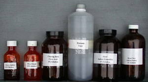
to know how complicated kallitype printing can become, have a look at Dick Stevens' book, Making Kallitypes: A Definitive Guide. Necessary Materials The Basic Chemicals Silver nitrate Kallitype requires six different solutions: 1) sensitizer, 2) developer, 3) clearing agent, 4) toner, 5) fixer, and 6) hypo-clear.
1) Sensitizer The sensitizer is prepared as two separate stock solutions, solution A and solution B, which are mixed in equal parts just before use. 2) Developer My preferred developer is a 20% solution of sodium citrate. Add 200g of sodium citrate to 750ml distilled water, stir until completely dissolved, then add water to 1000ml. 3) Clearing Agent The recommended clearing agent for my method of kallitype is a 3% solution of citric acid. To prepare, add 30g citric acid to 750ml water, stir until completely dissolved, then add water to 1000ml. 4) Toner See the section at the end of this article for various toner formulas. 5) Fixer 6) Hypo Clear The hypo clear is a simple 1% sodium sulfite solution. To prepare, add 10g sodium sulfite to 1000ml water and stir until completely dissolved. This solution should be mixed just before use and discarded after about an hour or so, or after use. Paper Choosing a suitable paper is one of the most important factors in making kallitypes. Papers that will not clear completely in about 4-5 minutes should not be used. Most of the papers that work well with pt/pd printing also work well for kallitype. I have had good success in kallitype with Crane's stationery AS 8111, Platine, Bristol 2-ply Rising, Stonehenge Rising and Fabriano Artistico. Of these, my personal preference is Stonehenge Rising. It has a nice pebbly surface, gives good image detail, and clears easily. Light Source Printing requires a light source high in ultraviolet light, of which there are a variety: the sun, a bank of black-light fluorescent tubes, mercury vapor and metal halide HID lamps, as well as
commercial plateburners such as the Nuarc 26-1K. More information on light systems can be found in my article Ultraviolet Light Sources for Printing with the Alternative Processes.
The Negative Although considerable contrast control is available in kallitype, it's advisable to start with a good
negative and then apply corrective controls later. The best negative for kallitype has a density range of about log 1.8. This is a very contrasty negative that will not print well even on a grade #0
or #1 paper. If you are making in-camera negatives with sheet film, this density range can be achieved by developing the film about 50% longer than normal for silver gelatin #2 paper.
|
||||||||||||||||||||||||||||||||||||
|
|
|
|


