 |
|||
|
|
|
Vandyke Brown: by Sandy King
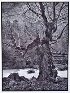
Overview of the Process In Vandyke a suitable paper is coated with a solution containing ferric ammonium citrate, silver nitrate and tartaric acid, using either rod or brush. When dry, the sensitized paper is exposed by contact printing to a negative under an ultraviolet light source. Exposure may be done in a contact-printing frame, in a vacuum frame, or even by simply placing the negative and sensitized paper under a sheet of thick glass. After exposure, the paper is developed in plain water, toned, fixed, washed and dried. There is virtually no control of contrast with the Vandyke process so it is essential to begin with a negative of the right contrast. This is an important consideration in printing with in-camera negatives because the negative must be exposed and developed to exactly the right contrast for optimum results. However, if one prints with digital negative it is an easy matter to adjust the contrast of the negative to exactly match the process and the UV light source. There are many good articles on the web and in books on Vandyke printing. This article will focus on gold toned Vandyke because of the very distinctive look of prints toned with gold, and their excellent long term stability. Toning a Vandyke print with gold will result in a very high percentage of the silver metal being replaced with gold metal. The print will have a distinctive blue tone, but more importantly the image is made up mostly of gold metal, which is highly stable, even more so than platinum and palladium.
Vandyke, like kallitype and platinum/palladium, gives richer tones if coating and drying is carried out in conditions of high humidity, at least 50% RH in my experience. If the room conditions
cannot be raised to an acceptable RH the paper can be moistened before sensitizing by holding it over a kettle of boiling water for a couple of minutes. Notes on Image Permanence The Vandyke process is based on ferric ammonium citrate, which contains ferric iron, Fe (3+). On exposure to ultraviolet light, ferric iron is reduced to ferrous iron, Fe (2+). To make a silver-iron print ferrous iron must be further reacted with silver nitrate. The major danger to long-term permanence of a Vandyke print image is residual ferrous iron, Fe (2+). If even very small quantities of residual ferrous iron is left in the paper it will eventually oxidize the silver, and the image will fade. One of the keys to getting maximum archival quality with Vandyke is to make sure that initial development is carried out in a water bath that is slightly acidic. If the water is alkaline the residual ferrous iron will be set in the paper. On the other hand a water bath that is too acidic will reduce the silver and the reflective DMax of the print will be reduced. The second key to image stability with Vandyke is direct toning in which the silver is replaced with another noble metal that is more resistant to oxidation by residual ferrous iron. Gold is the most noble of all metals and gives a highly distinctive cool blue tone print that is very archival. While Vandyke prints can also be toned with platinum and palladium the focus in this article is on making gold metal prints by toning with a gold thioruea formula.
For general instructions on working with alternative processes please consult the excellent article by Mike Ware, Preparations for Alternative, on his personal web site at http://www.mikeware.co.uk/mikeware/preparations.html. I highly recommend this article for anyone new to alternative
printing. Necessary Materials for Vandyke Printing 1. The Basic Chemicals Vandyke requires only five different solutions,: 1) sensitizer, 2) acid water-bath developer, 3) toner, 4) fixer, and 5) clearing agent (hypo-clear or equivalent). 1) Classic ABC Vandyke Sensitizer
2) Developer Development is two slightly acidic water baths, for two minutes in each, followed by a rinse. It is essential that the bath be slightly acidic to avoid staining from residual iron. The right pH is achieved by adding about a teaspoonful of citric acid per gallon of water. The purpose of the development bath in water is to rid the print of the silver nitrate and iron that was not used in image formation during exposure. Silver nitrate is very soluble in water and after two minutes in the first bath the water should be very milky, indicating that most of the soluble silver nitrate has released from the paper and fallen into the water. A second water bath of two minutes should clear the paper of any remaining silver nitrate. After development look carefully at the coated areas of the paper that were not exposed. If there is stain it is most likely due to the water being too alkaline. Unfortunately once the stain forms it is difficult or impossible remove it without also reducing the image. In most cases two baths of two minutes each is sufficient to remove all of the residual silver nitrate. Longer times could also be used but whatever time you choose be consistent and always develop that way in order to obtain consistent results. 3) Toner Rinse the print in running water for about a minute after development, then tone. In toning, the silver of the print is replaced with the more noble metal of the toner. It is recommended that the gold thiourea toner be used one-shot and discarded after use. Toning should be complete in about five minutes. 4) Fixer Add 50g sodium thiosulfate to 750ml water and stir. When the chemical has dissolved, add water to 1000ml. This makes a 5% sodium thiosulfate solution. 5) Clearing Bath The clearing bath is a simple 1% sodium sulfite solution. To prepare, add 10g sodium sulfite to 1000ml water and stir until completely dissolved. This solution should be mixed just before use and discarded after clearing. Alternatively, commercial solutions such as Kodak Hypo Clear and Heico, diluted for clearing papers, can be used in place of the sodium sulfite solution. 2. Papers
Many papers will give higher reflective Dmax if they are first pre-soaked in a weak (1% -5%) solution of citric acid or oxalic acid. Soak the paper for about two minutes, and then hang to dry. The paper can be used as soon as it is dry to the touch. Lanaquarelle is a beautiful very white paper that does not give good Dmax unless acid soaked but when soaked with a 1.5% solution of oxalic acid for a couple of minutes the reflective DMax is greatly improved. The same is true for a number of other papers, including Fabriano Artistico and Arches Aquarelle. The acid solution should be fairly cool to avoid removing the internal sizing. 3. Light Source Printing with the Vandyke process requires a light source high in ultraviolet light, such as the sun, a bank of black-light fluorescent tubes, and commercial plate makers such as the Amergraph ULF-28 or the Nuarc 26-1Ks. For some design consideration please see my article on light sources for alternative printing at https://unblinkingeye.com/Articles/Light/light.html. 4. The Negative There is no practical way to change the contrast of the Vandyke process so it is essential that the negative have the right contrast if the entire range of values on the negative from the shadows to the highlights is to be transferred to the print. For best results the optimum density range of negative used gold-toned Vandyke should be about log 1.8, though it may vary some with the light source. Excellent digitally enlarged negatives can be prepared using any one of a number of methods, such as PDN or QTR. A great advantage of digital negatives over original camera negatives is that they all can be made to have the same printing characteristics in terms of density and contrast range, so that exposure time and contrast of the print can be consistent. It is also possible to make good enlarged negatives for contact printing with traditional film by wet processing but unless one has great control of exposure and development these negatives will lack the consistency of density and contrast possible with digital negatives. You will probably want to mask your negatives to eliminate brush strokes on the final print. My preferred method with digital negatives is to tape around the image area with red lithographer's tape. You can also add a printing mask around the negative in Photoshop. For in-camera negatives cut a frame in Goldenrod paper slightly smaller than the printing area of the negative and tape the negative to the paper. 5. Contact Printing Frame or Vacuum Frame. When making the exposure good contact between the negative and sensitized paper is critical for print sharpness. If there is not good contact the print will have an overall soft look with localized
blurry areas. A contact printing frame works fine for prints up to about 11X14” but for print sizes larger than 16X20” a vacuum frame is recommended. Working Procedures Processing can be carried out in separate trays for all of the solutions if you have the trays and space. However, it is also possible to carry out all processing in a single tray, with a short water rinse between each step.
1) Coat the Paper Begin the coating operation by placing several sheets of newspaper on a flat, level surface, and then tape the paper you will be printing on to the newspaper, or attach it with pushpins. This will prevent the paper from moving around when you brush on the sensitizer. Measure out the required amount of sensitizer and gently pour it over the center of the paper. You will need about 2ml of sensitizing solution per 8X10 print, but some papers need more, others less, depending on sizing. Using a good quality artists' brush like the Richeson, quickly spread the sensitizer over the printing area of the paper, stroking lightly across the paper from left to right, then from bottom to top, and finally on the diagonal. Continue with light brushing until there is no more pooling of the sensitizer, at which point stop. A coating rod could also be used and is often recommended as a method of using a minimum of coating solution. However , the experience of many alternative workers is that coating with a good synthetic brush like the Richeson does not waste more sensitizer than coating with a rod, and the brush allows double coating, which is not feasible with a rod. Some papers work fine with just one coating but others should be coated twice for maximum reflective Dmax. When double coating I dilute the sensitizer 1:1 with a 5% solution of citric acid in order to acidify the paper slightly. Allow the first coat to dry about five minutes before applying the second coat. 2) Dry the Sensitized Paper
3) Expose the Sensitized Paper Place the emulsion side of the negative in contact with the sensitized paper, with the base of the negative facing the light, and place the sandwich in a contact printing frame, vacuum frame , or between two heavy sheets of glass, and expose to UV light. If your negatives stick to the sensitized paper either dry the paper longer, or use a sheet of mylar between the negative and paper. 4) Develop the Print After exposure wash the print in two water baths for two minutes each at around 70º F. It is important that the water be slightly acidic. If very alkaline the print will develop a yellow stain, as the residual iron in the print will change to hydroxide. If the water is too acidic the silver metal will be reduced and shadow density (Dmax) will be weaker. The correct pH is achieved by adding about one teaspoonful of citric acid to a gallon of water. 5) Toning When using the gold thiourea formula given in this article toning begins first in the highlights, proceeds to the mid-tones, and ends with the shadows. The print is fully toned when the shadows have taken on the color that is characteristic of the gold toner, a cool blue tone. Toning will normally be complete in about five minutes, but prints that have large shadow areas will take much longer to tone, and require more toner solution, than images that consist of mostly mid-tone and highlight detail. As the print is toned with gold it first becomes brownish-purple, then gradually the color will change to grayish-blue, which indicates toning to completion. With the toner used full strength, the print should be fully toned in about five minutes. After toning rinse the print for about a minute in running water before fixing. The toning metal will replace a high percentage of the silver metal in the print, but not all of it, so a final toned with gold will be comprised of a very high percentage of gold metal and a smaller percentage of silver. Based on reduction tests I have carried out toning to completion appears to replace about 90% of the silver with gold metal. 6) Fix Fix for three minutes in a 5% sodium thiosulfate solution. For maximum archival quality, use two separate fixing baths and fix for two minutes in each, with a rinse of about one minute in running water between the first and second bath. The second bath should always be fresh fixer. The silver nitrate that is not used in image formation is highly soluble so in theory Vandyke prints need much less fixing than silver gelatin prints. It is important to remember that a strong fixing solution, or fixing for too long, will bleach any silver metal that remains in the print after gold toning. This will reduce reflective DMax. 7) Clear (Optional) After fixing place the print in a 1% solution of sodium sulfite for two minutes. Kodak Hypo-Clear or other clearing agents can also be used. An alkaline clearing bath will leave the paper in an alkaline condition that is beneficial for long-term print stability. 8) Final wash Wash the print in running water for 5-10 minute. If a clearing bath is not used wash the print for 20 minutes in running water. 9) Dry Hang the print to dry, or place on a drying rack. More about Toning Many people like the native color of Vandyke prints and do not tone them. In my opinion, this is a mistake, because toning provides much greater image permanence. Un-toned Vandyke images will eventually fade as it is virtually impossible to remove all residual ferrous iron from the paper, and if any at all remains it will eventually react with the silver and cause the image to fade.
Still another reason to tone is that it eliminates the effects of solarization. In heavily exposed areas there will be tone reversal in un-toned Vandyke’s that causes the shadow areas to get lighter. This look can be very unpleasant. Toning with gold counteracts tone reversal and restores normal tonal values in the heavily exposed shadow areas. For greatest consistency the toner should be used as a one-shot solution, using the minimum amount of fresh solution possible, and then discarded after use. Using such small quantities of toning solution requires a flat tray with no ribs or grooves. With a flat bottom tray you will need approximately 30ml-40ml of solution to fully tone an 8X10” print. Most of the toner is used in the shadows so images with large shadow areas will need more toner than those that have mostly mid-tone and highlight values.
The gold thiourea toner gives a very attractive purple/brown/blue tone and adds a slight increase in contrast. The toner keeps well and retains its working characteristics even after several months in storage. Making Digital Negatives for Printing with Vandyke Most alternative print makers today are using one of two main methods to produce digital negatives: Mark Nelson’s PDN system (https://www.precisiondigitalnegatives.com/), or Ron Reeder’s QTR system (http://www.ronreeder.com/). I used both systems to prepare digital negatives for making gold toned Vandyke prints and the results were equally good. The difference
between the two systems is that with PDN linearization is done with an .acv curve that is applied in Photoshop whereas in QTR linearization is made at the printer driver level by controlling ink
deposits. The latter method is in theory preferable because it eliminates the possibility of posterization which may result if applying a very abrupt .acv curve. In practice, however, I have
never found this to be a problem with the use of .acv curves with PDN. Of the two systems PDN is easier to learn but QTR is potentially capable of greater control. Sources for Chemicals, Metal Salts and Papers Artpaper Artcraft Chemicals, Inc. Binders Art Supplies and Frames Bostick & Sullivan Daniel Smith Art Supplies New York Central Art Supply
|
|||||||||||||||||||||||||||||||||||
|
|
|
|
