|
Tips & Tricks for Blue Toning - Page 2
by Liam Lawless
Straight Blue Tones and Iron-Sabatier
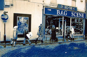 Iron toners are capable of subtle or deep blue tones, but
two potential problems effectively limit the depth of colour that can be achieved on a given paper. The first of these is staining, which will start to happen at some point during
toning, depending on the paper and the strength of the toner. Iron toners are capable of subtle or deep blue tones, but
two potential problems effectively limit the depth of colour that can be achieved on a given paper. The first of these is staining, which will start to happen at some point during
toning, depending on the paper and the strength of the toner.
Light and moderate staining can normally be removed by washing and/or clearing, but it may not be possible to
eliminate heavy staining without also altering the image. And any staining of the back of FB prints is usually impossible to remove, so it is necessary to find
, for each paper that you use, just how far you can tone without encountering an irremovable or objectionable stain.
The dilution of an iron toner is far from critical; a weak solution can do just the same as a strong,
but requires more time to do it (and, of course, has a lower capacity). But a short time in a strong solution stains more than the longer time for an equivalent result in weak solution, so the weaker
should generally be used, though weak solutions can take a very long time for heavy toning. The 1+1+22 dilution quoted earlier is a good compromise, or use at half that strength (1+1+46) when
only very subtle colour is wanted. But if strong colour is what you want, it will be necessary to test just how far you can go.
The other problem is the iron-Sabatier effect, variations of which can be produced in a number of ways, but which also has a habit of appearing when it is not wanted. Its main causes are the same
as for staining (though it mostly takes longer to appear than staining), and it is avoided in exactly the same way: by not toning too strongly, or by using a weak toning solution rather than a strong
one. The effect will occur on most papers if they are toned long enough, but some (such as Kentmere Kenthene) suffer quite badly and these are obviously the ones to choose when the effect
is deliberately sought! Avoiding such papers allows longer (or stronger) toning to take place before the effect occurs.
Note that the iron-Sabatier effect might show itself during clearing or washing, in which case
shorter clear and wash times should, if possible, be used in future.
Untoning
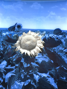
Selective toning is easily carried out by blue toning a whole print, then painting over those parts which are required untoned with a
working strength print developer. Use a fine brush for outlines and fine detail, or a broad brush, cotton wool swab, etc., to deal with large background areas.
Development restores the bleached silver to its original condition, while bleaching of the Prussian blue to hydrated ferric oxide (sometimes referred to as ferric hydroxide) is caused by the
developer's alkaline pH. To render the print as permanent as possible, the hydrated ferric oxide should be removed by giving an acid fix.
Luminous Tones
"Luminous" isn't quite accurate, but is the best description I can find for the vivid, transparent
turquoise colour of this effect that works well on any paper. Overexpose your print by about 50% and blue tone for 3-4 minutes at the 1+1+46 dilution; toning should produce a good colour, but not
be too heavy. Now give a short wash and bleach in sepia bleach, at a fifth to a tenth of its normal working strength, until you see the effect you want, then wash again and fix (in any fixer).
What we are doing here is to remove some or all of the black silver that was left after toning, and this is done by first converting it to silver bromide in the bleach, and then dissolving it in fixer so
that the final image consists of Prussian blue alone. Bleaching does not have to go to completion if you want the shadows to retain their depth.
Brown and Red Tones
 A blue toner alone cannot produce brown or red tones, but in conjunction with sepia
and gold toners excellent examples of both are possible. The colourless silver ferrocyanide that is a by-product of toning is changed to brown silver sulphide with
a sepia toning bath, while the ferric ferrocyanide (Prussian blue) becomes ferrous sulphide. The result is a good, yellow-brown mustardy colour that is rather
different to that obtained by straight sepia toning. (Note that ferrous sulphide may or may not be fully archival, but Dallas Simpson has noted no apparent change in prints up to 10 years old). A blue toner alone cannot produce brown or red tones, but in conjunction with sepia
and gold toners excellent examples of both are possible. The colourless silver ferrocyanide that is a by-product of toning is changed to brown silver sulphide with
a sepia toning bath, while the ferric ferrocyanide (Prussian blue) becomes ferrous sulphide. The result is a good, yellow-brown mustardy colour that is rather
different to that obtained by straight sepia toning. (Note that ferrous sulphide may or may not be fully archival, but Dallas Simpson has noted no apparent change in prints up to 10 years old).
The procedure is to blue tone for as long as required, wash for 3 or 4 minutes and then place in a sepia toning bath (no bleaching required). The sepia toner takes longer to act than normal and 5
minutes should be allowed. Any staining that may have been left by the blue toner is removed almost instantly by the sepia toner, no matter how bad or on what sort of paper.
If the print is now placed in a gold toner (after washing), the brown is replaced by beautiful coppery reds that are much richer than obtained by gold after straight sepia toning. The reds tend
to be best on cold-tone papers; on warm-tone, a softer, light orangey-brown colour should be expected. And remember that for archival permanence a short fix must be given after toning with gold.
On cold-tone papers, blue+sepia toning can produce a fairly strong split tone effect whereby the lighter image tones are brown and the darker tones black (depending on the blue toning time, and
how much black silver remains after toning). The hue of brown may be adjusted if a variable sepia is used, but the depth to which prints are blue toned adjusts the position of the crossover (the
tone level which separates the brown from the black tones) and is the main variable in this toning process. Light blue toning places the crossover near the highlight end of the scale, whereas
heavier toning moves it towards the shadows.
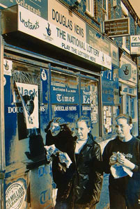 For the best results, pretty heavy blue toning is required; the very
intense blue is replaced by a much weaker brown when a blue print is sepia toned, so blue toning needs to have been carried out to a fair depth for the brown to be even noticeable. Despite the strength of the
blue colour, toning through the full depth of a silver image takes a long time - in excess of 30 minutes at 1+1+22. To avoid the split tones which will result if some unchanged black silver remains after blue
toning, use the 1+1+10 dilution for 20-30 minutes. (Note that the print will stain badly during this time, but is cleaned up by the sepia toner.) For the best results, pretty heavy blue toning is required; the very
intense blue is replaced by a much weaker brown when a blue print is sepia toned, so blue toning needs to have been carried out to a fair depth for the brown to be even noticeable. Despite the strength of the
blue colour, toning through the full depth of a silver image takes a long time - in excess of 30 minutes at 1+1+22. To avoid the split tones which will result if some unchanged black silver remains after blue
toning, use the 1+1+10 dilution for 20-30 minutes. (Note that the print will stain badly during this time, but is cleaned up by the sepia toner.)
But split tones can be attractive, and will be obtained on an image of normal density range with a toning time of 10 minutes in a 1+1+22 solution. This time is recommended for your first trials.
The paper itself is another variable, of course, influencing both the crossover position and the image colour. The colour does not actually differ very much between different papers of the same
type, but, since they tone faster in iron blue, warm-tone papers will have a crossover closer to the shadows than cold-tone for a given time in the blue toner.
Exposures should be adjusted as they would for blue toning on cold-tone papers (i.e. print a little lighter), but warm-tone prints lose much of their original density by this treatment and will need overexposing by up to 50%.
Extended Clearing
Extending clearing beyond the point where staining has cleared gives a range of colours without
involving any other toners, and the strongest form of the iron-Sabatier effect. Starting with a heavily blue-toned print, clearing first removes colour from the deep shadows where it is replaced
with neutral black, and a little later the highlights become yellowish. The blue in the midtones, meanwhile, takes on several different hues and, with a suitable subject possessing good contrast in
areas of fine detail, Mackie lines may also appear.
The starting point should be a normally exposed print, with a full, normally distributed tonal range
(i.e. not high-key or low-key), and with dense blacks in the shadows. Once again, RC papers generally work best. Blue tone for 15-30 minutes (1+1+10 dilution), and (after a short wash) use
the clearing solution at 1+29; depending on the wash time, image size and volume of clearing solution used, it may need replacing once or twice for a single print. For FB papers, the 1+14
dilution will probably be needed, but it is still unlikely to clear the back of prints. (Not that a stained back necessarily matters, but choose an RC if a pristine white backside is important to you.
Or a print developer will clean it, but keep off the image!)
It may take as long as 10 minutes before you notice any changes in the image, but once begun the
rate of change increases. Replace the clearing solution when discoloured badly, or if it slows down too much. Or use it stronger if you feel you can cope with faster action.
Bill Rowlinson's Method
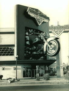 In Darkroom User 1998/4, Bill Rowlinson gave a rather cryptic
description of his method in an interview with David Warr. I worked with Bill on toning for a time and, with his approval, can reveal it in a little more detail. In Darkroom User 1998/4, Bill Rowlinson gave a rather cryptic
description of his method in an interview with David Warr. I worked with Bill on toning for a time and, with his approval, can reveal it in a little more detail.
Bill's idea was to greatly dilute the sepia toner (used after blue toning, as in "Brown and Red Tones", above), so that the transition from blue to brown takes place very gradually, allowing the print to
be pulled for washing at any stage while it still contains blues as well as browns. But if done right, we get a very graphic kind of effect with a sharp transition between brown and blue tones, with
yellowish tones and often Mackie lines in addition. The effect is fairly unpredictable, but almost always striking.
Any sepia toner, odourless or smelly, can be used, and is diluted to about a tenth of its normal
working strength (by adding 9 parts water), but this dilution may need fine tuning. Bill and I made our own sepia, but proprietary brands may need considerable dilution. Tony McLean gives the
following formula for the working strength sepia toner that he uses with this technique at his workshops:
Bill would blue tone for an hour at the 1+1+10 dilution (though using a slightly different formula to
that at the beginning of this article) before transferring the print to the sepia. Such very long times undoubtedly give the best results, but few of us are so patient, and times as short as 20 minutes
should produce something quite similar.
Bill has always worked exclusively with fibre base papers and favours Ilford MG IV for this
method, a choice with which I would agree (though the old MG III was much better!) Kodak Ektalure is also very good, but, for those who use them, RC papers generally seem to perform best;
Kentmere VC Select is particularly recommended.
Prints need to be overexposed by about 20% for this method, and gold toning afterwards changes the brown areas of the toned print to red or orange, as above.
Split Toning with Zinc Chloride
 This is a Colorvir technique that works well with Film Plus Blue Toner or the
formula given earlier. Added to a working strength blue toner, zinc chloride has the effect of protecting the lighter image tones from the action of the toner (or, more
accurately, it slows down its action on the light tones, so toning must not be continued too long), resulting in blue-toned shadows and untoned highlights. The
position of the crossover may be adjusted by the quantity of zinc chloride used. This is a Colorvir technique that works well with Film Plus Blue Toner or the
formula given earlier. Added to a working strength blue toner, zinc chloride has the effect of protecting the lighter image tones from the action of the toner (or, more
accurately, it slows down its action on the light tones, so toning must not be continued too long), resulting in blue-toned shadows and untoned highlights. The
position of the crossover may be adjusted by the quantity of zinc chloride used.
Zinc chloride in a blue toner has several other effects, as follows:
· It slows down toning considerably. Allow anything up to 5 minutes for a colour change to begin.
· The toned image colour is a little greener.
· Areas that are still affected by the toner are not coloured quite so strongly.
· It largely prevents the staining of whites that can be such a problem on FB papers. The more zinc
in the toner, the more effectively it does this.
· It turns the toning solution greenish and somewhat cloudy. It also causes some precipitation of
ferric ferrocyanide during toning, but this does not materially affect the toning action.
Zinc chloride has no other photographic uses that I know of, and is not listed by Rayco or
Silverprint, but is very cheap from chemical companies (e.g. £6.10 + VAT for 500 g from Sigma-Aldrich), and is only used in small quantities. For use, a 2½% solution is convenient (2½ g in
100 ml water); tap water is OK and the solution lasts indefinitely without any special precautions.
A blue toner dilution of 1+1+22 is recommended for split toning with zinc chloride, and try adding
from 1 to 8 ml of zinc solution to every 100 ml of working strength toner. Tone until the required depth of colour is seen in the shadows, but remember that the lighter image tones will eventually start to colour.
The exact amount of zinc chloride needed for a particular result varies with different papers and has to be found by experiment, but too much zinc will prevent the print from toning at all. The
subtle effects that result from a relatively large amount of zinc are often the most attractive, and for your first test 5 ml of zinc solution per 100 ml of toner will almost certainly give a good result.
Remember, though, that toning may take a long time to begin.
Blue+zinc works on all papers, but cold-tone papers give a sharper separation between the toned
and untoned parts of the image, for a "cleaner" look; on warm-tone papers, there is a more gradual transition.
Because such small amounts of zinc are needed, it needs to be measured accurately for predictable
, repeatable results. I prefer syringes, but droppers (from chemists) are another method, albeit more troublesome. There are normally about 20 drops to 1 ml, but you should verify this with your own dropper.
Split Toning with Sepia
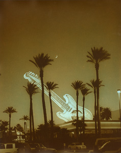 In common with most "conventional" split toning techniques, the
first method covered here begins with brief toning to add colour to just the lighter image tones, and then the second toner puts a different colour into the dark tones, but, for reasons to be given,
this approach is not possible with the second method. The first, "Brown-Blue" produces brown tones below the crossover (in the light tones) and blue tones above it (in the shadows), while the
colours are reversed in "Blue-Brown". In common with most "conventional" split toning techniques, the
first method covered here begins with brief toning to add colour to just the lighter image tones, and then the second toner puts a different colour into the dark tones, but, for reasons to be given,
this approach is not possible with the second method. The first, "Brown-Blue" produces brown tones below the crossover (in the light tones) and blue tones above it (in the shadows), while the
colours are reversed in "Blue-Brown".
(a) Brown-Blue
Using the bleach bath from a sepia toner, diluted if necessary for control, bleach out just the lighter image tones, stopping while
plenty of black silver still remains in the shadows; shadow tones should look virtually unaltered by the bleach. Now sepia tone and wash well.
We should now have a split-toned print in which the light tones consist of brown silver sulphide, and darker tones still containing unchanged black silver that can be acted upon by a blue toner.
But the blue toner (used at any desired dilution) also turns the sepia-toned light tones of the image to a dirty greenish colour which is restored to brown by treating the whole print in clearing
solution for as long as necessary.
(b) Blue-Brown
The highlight colour (blue) cannot be put down first, as it would be in most split toning methods,
because it would then be destroyed by the sepia toner. One way round this problem is to bleach the print fully and partially redevelop (in dilute print developer) before sepia toning, and blue tone
afterwards. The shadow colour is thus put down first, but the redevelopment stage has preserved some black silver in the highlights, that is unaffected by sepia and can be blue toned. Blue toning
is then followed by clearing as necessary.
But the method is not always completely successful because of how developers are made. What
we want, ideally, is to redevelop the highlight tones fully, at the same time leaving the shadows substantially undeveloped (and so able to respond to sepia toning). But with most developers the
highlights and shadows develop more or less simultaneously, preventing a good "split" between the two toning colours. This is because they mostly contain two developing agents: either
phenidone or metol, which effectively develop the lighter image tones, with hydroquinone, which is responsible for the heavier densities.
Experiment is required, therefore, but a developer containing a single developing agent is recommended if you can get hold of it or make it: a couple of suggestions are amidol formulae, Kodak D-23, or a colour print developer.
Compression Toning
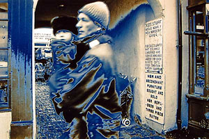 This is a method of Dallas Simpson, who once taught me
much of the little I know about ferrocyanide toning. It also produces split blue-brown tones, but this time using a sulphide sepia toner, and of a rather different character than we have seen so far. This is a method of Dallas Simpson, who once taught me
much of the little I know about ferrocyanide toning. It also produces split blue-brown tones, but this time using a sulphide sepia toner, and of a rather different character than we have seen so far.
Sulphide sepia is not much used now, probably because of its rotten egg smell, and the fact that virtually the same colour can be achieved with odourless sepia toners (which
are based on thiourea). But sulphide also causes intense fog in any unexposed film or paper that its fumes may reach and is harmful to the stability of finished silver images, so it should be used
well away from the darkroom and preferably out of doors.
Colorvir's sepia toner is the only one I know that still uses sulphide, but its strength is unknown to
me and we must therefore make our own 20% solution of sodium sulphide with (for example) 20 g in water to make 100 ml). This is for crystalline sodium sulphide; if using the fused (dry) form, the
equivalent strength is 7% (7 g in 100 ml). It keeps well at this strength, whereas weaker solutions do not.
Starting with a fixed and washed print that has been overexposed by 40-50%, bleach about half
way in sepia bleach, and wash to clear the yellow stain before toning. The toning solution is made by diluting the stock sulphide solution 1:1000 (1 ml to 1 litre!)
The idea behind such a weak solution is that the sodium sulphide is hydrolysed into sodium hydroxide and hydrogen sulphide. The hydrogen sulphide (responsible for the bad egg smell!) is
what actually does the toning, but is only capable of producing weak tones.
 Toning should be kept short (under 2 minutes) and the print removed to the wash
before all of the bleached parts are fully toned, leaving only the very lightest parts of the image completely toned. The darker tones that were bleached will also be
brown, but (after the fixing step that follows) pale and of flat gradation, hence Dallas's name of "Compression Toning". Toning should be kept short (under 2 minutes) and the print removed to the wash
before all of the bleached parts are fully toned, leaving only the very lightest parts of the image completely toned. The darker tones that were bleached will also be
brown, but (after the fixing step that follows) pale and of flat gradation, hence Dallas's name of "Compression Toning".
The print is now fixed in half-strength fixer for a minute or two (or use a 10% solution of hypo crystals, or 6% of anhydrous hypo) to remove any silver bromide that was left after the toning bath.
A stronger fixing solution could also attack the brown tones.
Now blue tone for 5-15 minutes at the 1+1+22 dilution, which affects only the darker image tones
where some black silver remains, but, as before, the brown tones are also likely to be discoloured. Clear as necessary to clean up the browns, then wash well. If desired, include an acid rinse
towards the end of the wash.
|
A Note from Tony McLean
My technique is quite similar to Liam's, though I dilute the sepia toner in 2 litres instead of 1.5. (dilution equals control and all that!). Cheap and nasty RC papers often give
the most vivid results. Low key images need less time in the blue toning solution and my average time for RC papers in the 'blue' solution is about twenty minutes. Don't
re-use the blue or dilute sepia toners. They are cheap and easy to make anyway.
Images with plenty of contrasting mid tones seem to work best. After some experience you will even be
able to shoot to order! ...pre-visualisation?
There are a few refinement tips on this process which may be of interest to you and your viewers. Eg. Blue toned prints can be converted
to a blue/green tone by immersing in a solution of nickel nitrate. This also has the effect of making a blue toned print almost 'alkali proof'.
Also... prints receiving the iron
sabattier treatment should have there surface lightly swabbed with damp tissue to remove the scum both after the initial prolonged blue toning and after the dilute thiourea bath. This will prevent
a cracked glaze appearance in the shadow areas and often will reveal a whole lot more detail and new colours!
|
|
|

