 |
|||
|
|
|
Three Color Gum – Taylor Made By Lear Levin
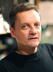
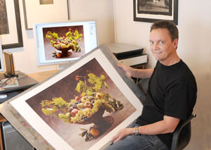
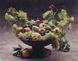
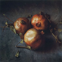
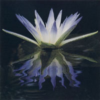
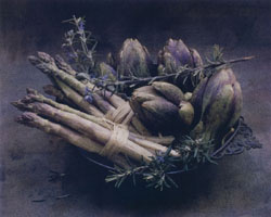
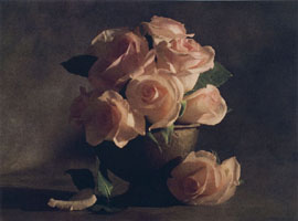
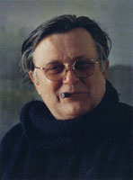
Keith Taylor is a diminutive, unpretentious, self-taught, expatriate Englishman who works out of his laboratory in Minneapolis, Minnesota. His superb technique has been perfected through extensive research, endless curiosity, imagination, strong convictions and thirty years of patient experimentation. Taylor’s work in silver, platinum and gravure has garnered him great attention and many awards, but it is three color gum printing that has brought him his greatest distinction, and the high quality and consistency that he regularly achieves in this century-old medium are second to none. Taylor’s client list boasts well-known fine art photographers from all over the United States and the British Isles. However, it was his Minneapolis friend, Cy DeCosse, that helped fire his interest in the three color gum process. DeCosse was a successful publisher, photographer and TV commercial director, who turned to fine art photography and became fascinated by alternative forms of printing. Using his empirical skills with Platinum, Taylor crafted masterful prints for DeCosse from images captured with the photographer’s 4 x 5 Sinar X and Rollei 6008 cameras. When DeCosse decided to switch exclusively to color for a new exhibit, he asked Keith to help him explore alternative forms of color printing – other than conventional Cibachrome or inkjet. He wanted his new work to look hand-made, painterly. He described his intention to photograph arrangements of fruit, classically presented against textured backgrounds and lighted to reflect the four seasons. He wanted his prints to be realistic looking and to be printed in full color, but at the same time, have the flavor of Pictorialism.
The three color gum approach won by default, and Taylor, with DeCosse’s backing, leaped to the task. He familiarized himself with the production of separation negative files on his Mac, the dilution of dichromate sensitizers, pigments, the properties of gum Arabic, myriad watercolor papers, and the best method to shrink and re-size them. He worked in his laboratory well beyond midnight for months searching for the correct combination of pigment, gum and sensitizer that would deliver a perfect balance of color in each of the three layers essential in creating a realistic looking print. The old mantra of gum printers that proclaims, “the final step in gum is to take your print, turn it upside down, then drop it into the trash can,” soon began to ring in his ears. Traditional methods used for producing three color gum prints begin with pre-shrinking a sheet of watercolor paper so that multiple washings will not change the paper’s size and throw the subsequent layers out of registration. The paper is dried and re-sized to keep the emulsion on top of the substrate, rather than sinking into the weave. Taylor, being a maverick, diverged from this accepted method and pursued instead a technique advocated by printing maven, Dick Sullivan. It required mounting the paper on a solid backing for the entire printing process – thus avoiding shrinkage and re-sizing. Sullivan had successfully practiced this concept with his own gum prints over four decades ago. He based it on a technique that he believes may have been first practiced by Pictorialist, Heinrich Kuhn. Following Sullivan’s lead, Keith had thin sheets of Aluminum cut and pierced to hold his paper and seat registration pins. The pins gave him a classic way of keeping all his negatives in perfect registration.
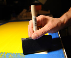
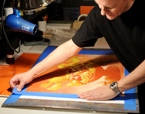
For the first layer of gum he prefers yellow. He places the thin-looking black and white separation negative (marked yellow) on the registration pins and indicates the corners of the image on his paper with a nearly invisible pencil dot. The print borders are created by masking the edges of the paper with soft-release painter’s tape, using the dots as a guide. Taylor was working large when I visited him in Minneapolis. The image that I watched him craft was 20 x 27 inches. It was one of ninety-three, three color gums, relatively similar in size, that he was printing for an exhibit DeCosse will be mounting in Florence, Italy in October of 2009. Since Dichromate is toxic, Taylor begins the mixing and coating stage of the process by donning a pair of surgical gloves. He then squeezes 2 grams of Cadmium Yellow Light watercolor pigment into a glass dish placed on an electric scale. (The prints he was producing for DeCosse demand large amounts of sensitized mixture, but the formula can be reduced proportionately for smaller images.) This first yellow layer is applied with an opaque pigment. The remaining two layers are created from transparent watercolors and, hopefully, will marry happily in colorful ménage à trois. If the opaque pigment were used as a second or third layer, the work would be ruined and unceremoniously dropped through a trap door into hell. With an eyedropper, Taylor draws 18 ml of Gum Arabic and adds it to the pigment. He mixes the two ingredients together thoroughly, then suctions 24 ml of a 15 % solution of Potassium Dichromate into another dropper and floods the reddish-orange sensitizing fluid over the rue. Once the three elements are completely mixed, he dips a foam brush into the dish. Then, with his fingers, wrist and mind seemingly welded together, he coats the paper using deft, allegro strokes. The brushes are changed three times until the coating looks as smooth as breath on glass under the subdued incandescent light of his laboratory. The work is allowed to set for a minute before it receives a blast of warm air from a hair dryer. When he is sure that the emulsion has begun to congeal, the masking tape is removed and the virginal yellow layer, framed neatly by white borders, is placed into a drying cabinet.
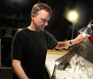
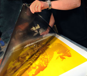
Taylor slips a 2 mil sheet of clear polyester between the Yellow separation negative and the coated paper surface. This invisible barrier insures the longevity of negatives that might otherwise become diminished by continual sandwiching against emulsion-coated paper in his powerful plate burner. With the mounted package carefully sealed inside a vacuum frame, his five thousand watt plate burner is turned on and an integrator brings the ultraviolet light up to its proper, blinding level, in seconds. A dense neutralizing shield keeps harmful UV rays at bay while Taylor tidies up his workspace. Because the sensitizing dichromate in gum work only reacts to Ultra Violet illumination, dim incandescent lights are allowed to remain on. This actually made me feel more like being in a laboratory environment than a darkroom. Taylor also finds the warmth of the lights comforting, especially during the long hours spent in his narrow confines. It keeps him from feeling like the subterranean creature that the darker world of the silver process often engenders. Comforting too is a cappuccino machine that dwells just beyond his doorway and a stereo that plays his favorite jazz or old radio programs from his native BBC. Anticipating the end of the exposure, Taylor fills his stainless steal sink with water tempered to soak the print at seventy degrees – for smaller prints he uses conventional trays. After roughly two minutes the huge plate burner shuts down and a darkened outline, embossed on a field of yellow, is clearly visible on the paper’s coating. The metal backing is turned over so that the print can gestate face down in the water bath. Its weight is supported from contact with the sink at the corners of its frame. Here, untouched, the exposed print will reside for thirty minutes until all the soluble, unexposed, coating drifts away and only those areas hardened by the penetration of the UV light remain.
At this point in the process, while flooding the emulsion with a gentle stream of water, shadow or highlight areas can be lightly brushed, if there is a need for additional reduction. After a few passes from the hair dryer to insure that the surface is setting, the print is once more placed in a drying cabinet. Taylor explained to me that the measurements for all the elements constituting the mixture for the magenta and the cyan layers, were the same as the yellow layer. (The reason for this will be outlined shortly.) Their exposures were also similar. Quinacridone Rose watercolor pigment is used for the magenta layer and Pthalo Blue red shade is applied as the final layer. The consistency that is the cornerstone of Taylor’s skill, could not have been possible were it not for his knowledge of computers – digital files are the method by which all his separation negatives are created. Yet even with all his wisdom and facility, his early efforts required many reprinted negatives from his imagestter. Sometimes highlights became stained and densities between the various separations were to often out of balance. Cyan was a particular problem; it stained and bled over margins. And since it was the last layer to be applied, and always after hours of extensive preparation, the boom of British accented curse words could often be heard reverberating throughout modest Minneapolis.
Through trial and error, a thirst for knowledge and a little help from his friends, Taylor has mastered many and varied aspects of the of the photographic process, while more still wait in the wings of his imagination. Yet even with all his technical understanding it is still magic for him when an image on paper emerges from the developing tray into the light. His three color gum prints can hold up a mirror to the past or illustrate the shadow and substance of contemporary life. But more than anything they reflect the man’s aesthetic and his dogged pursuit of perfection in the craft that he loves. “Perfection? Ahh yes, now that would be grand,” Taylor says with a modest laugh, “Were it ever to happen.”
Keith Taylor’s personal photography and the various alternative methods that he uses to finish his work, can be found at: www.keithtaylorphoto.com. To see photography by Cy DeCosse, printed by Keith Taylor, go to www.cydecosse.com. |
|||||||||||||||||||||||||||||||||||||||||||||||||||||||||||||||||||||||||||||||||||||||||||||||||||||||||||||||||||||||||||||||||||||||||||||||||||||||||||||||||||||||||||||||||||||||||||||||||||||||||||||||||||||||||||||||||||||||||||||||||||||||||||||||||
|
|
|
|
